Block Print:
|
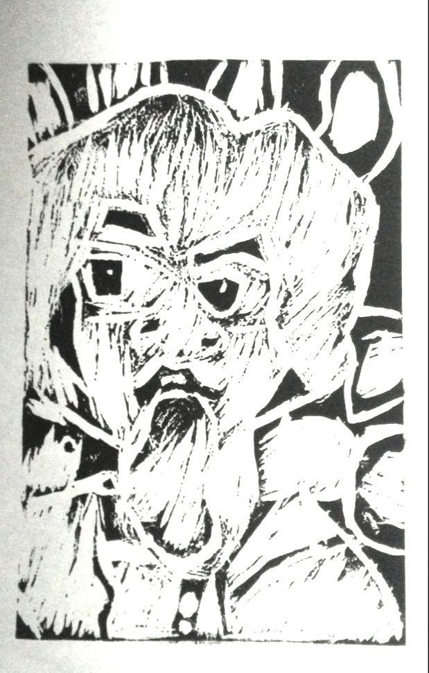
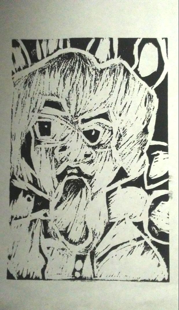
"Habits Never Die"
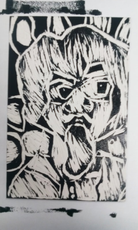
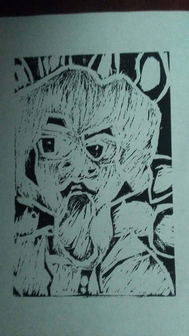
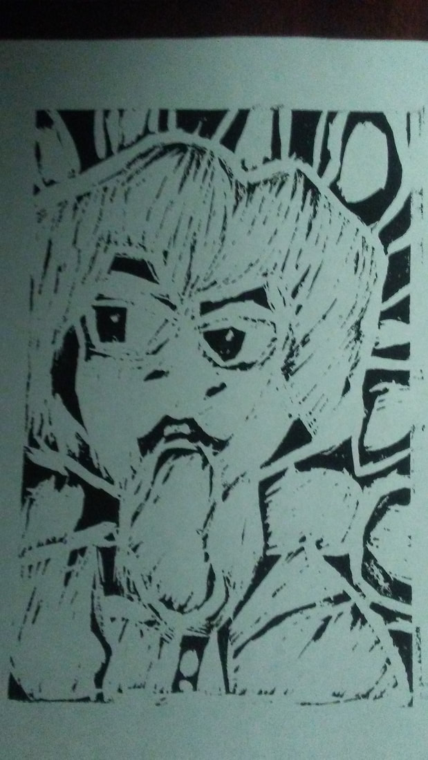
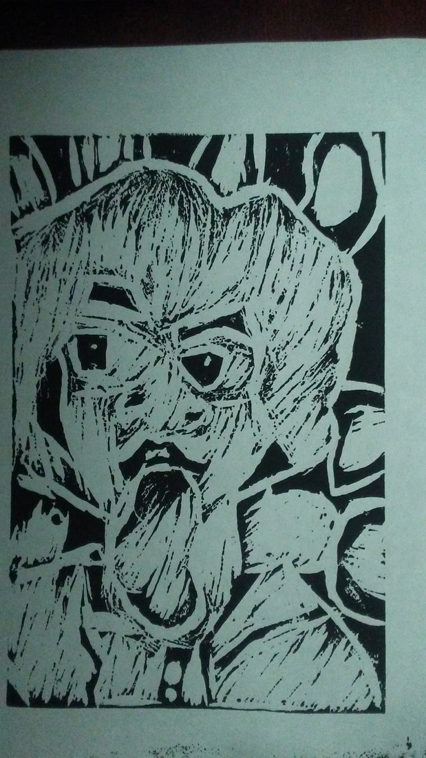
Block Print 15cm x 23cm September 9, 2019 Exhibition Text: The piece "Habits Never Die" was inspired by several Expressionist and Pop Art, paintings, specifically Quappi in a Pink Jumper by Max Beckmann, using it as a style template. It shows a picture of a woman smoking a cigarette and showing a half way smile. I wanted to give off a rough texture that usually smokers usually endure, so I carved thinner lines. The title is a reference towards people who think it's impossible to quit smoking, which is similar to my theme "Addiction". |
Planning:
|
|
Inspiration:
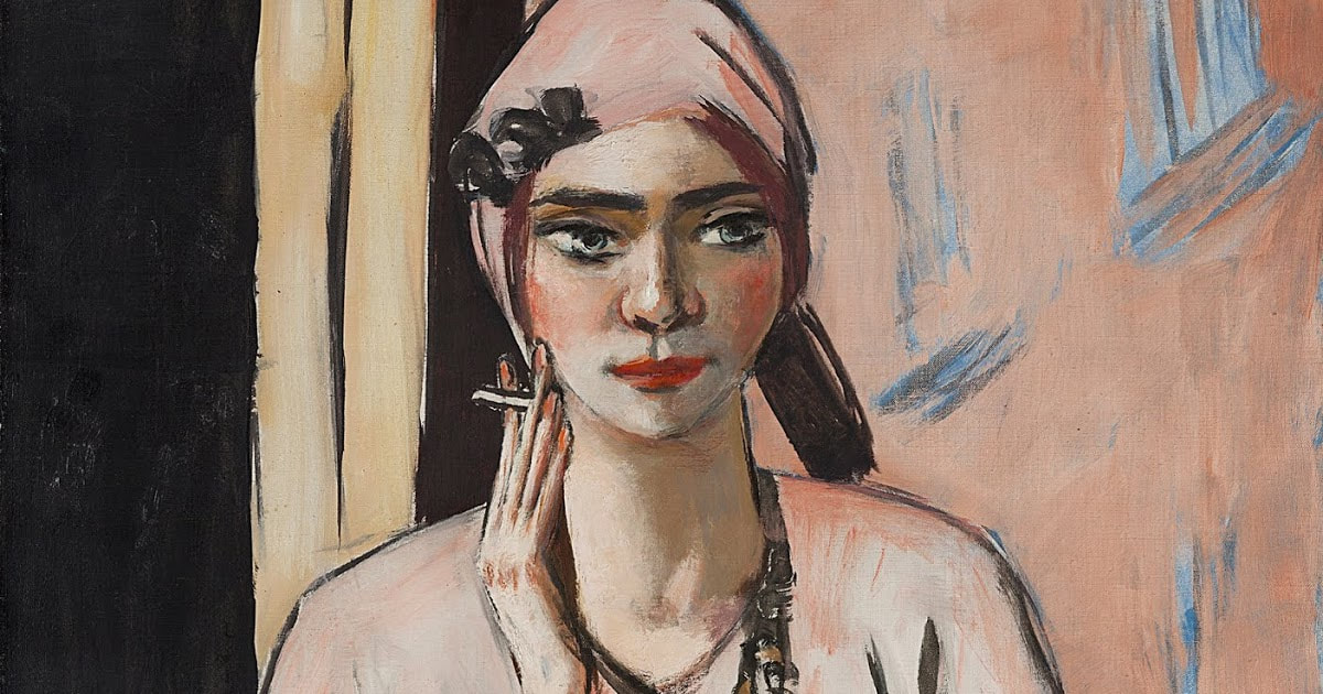
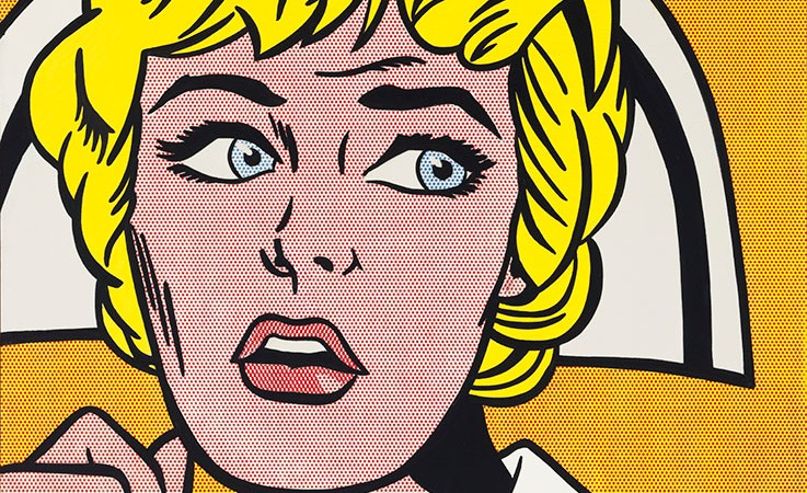
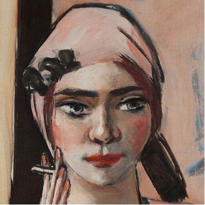
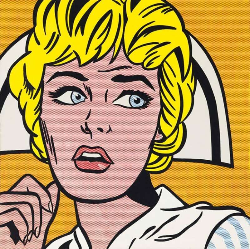
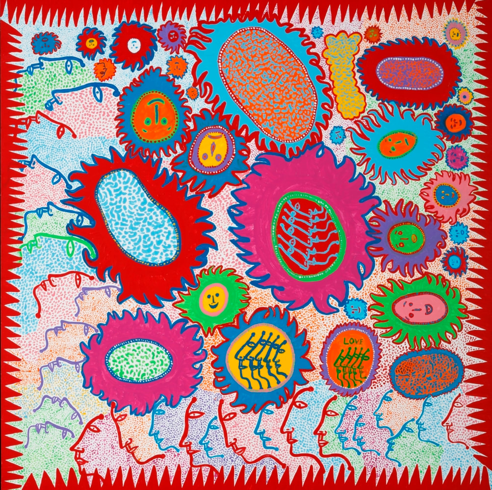
My inspiration for the block print originated from Expressionism and Pop Art. While brainstorming some sketches, I already knew I wanted to go for a German Expressionist aesthetic, so the first artist from memory I decided to look at was Max Beckmann. The piece I chose was called Quappi in a Pink Jumper, was the main highlight of my Block Print. The pose of the woman smoking a cigarette inspired me to create my piece in a similar fashion, so I wanted my piece to carry similar components. I didn't want to stump my imagination, so i decided to incorporate the painting style of Pop Art, so I started research several Pop artists, specifically Nurse by Roy Lichtenstein, and My Eternal Soul by Yayoi Kusama. I wanted to incorporate the thick eyebrows and head shape from Nurse because I love how thick the line art for the hair and eyelashes/eyebrows are for the piece. For Yayoi Kusama, I tried using her design style for my background on my final design. I found her art style to be very inspiring, especially in how much detail she adds in each oval and how inconsistent it is. I wanted to mimic it almost exactly like the original, although adding that type of texture would be difficult. |

http://poemasalbertolinscaldas.blogspot.com/2013/07/a-cidade-aberta.html
|
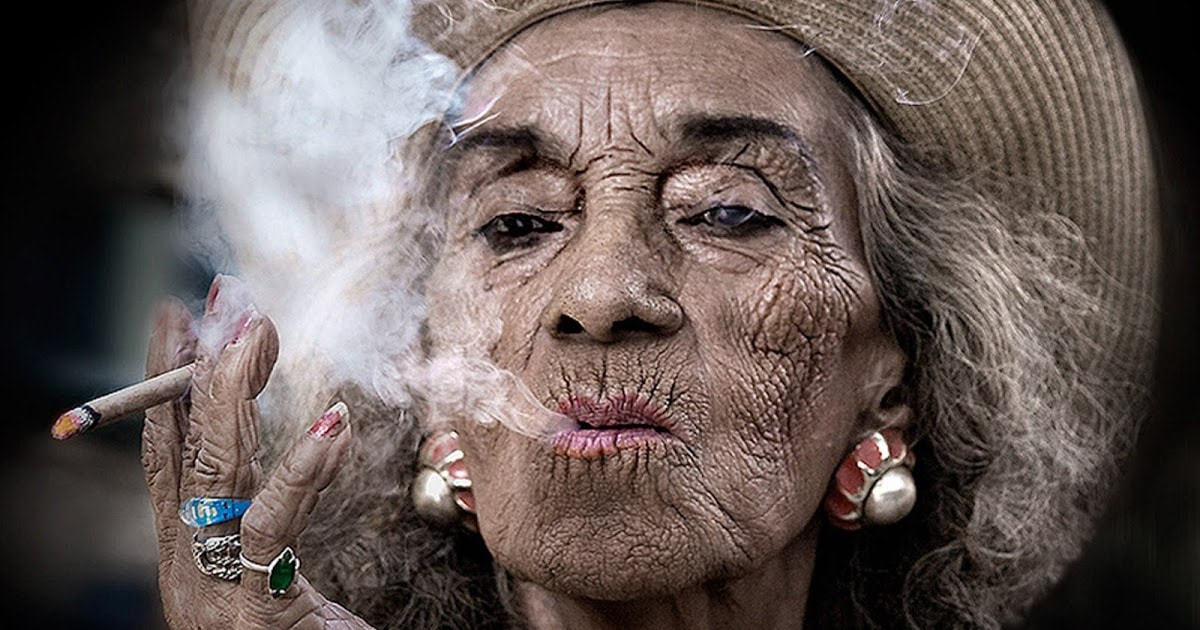
When researching for a similar skin type to carve, I discovered this picture on google images. I thought this image almost perfectly resembled the idea I was going for, and I liked how rough and dry her skin looked. Looking back to my artistic inspiration, this looks quite similar too Quappi in a Pink Jumper.
|
Sketches::
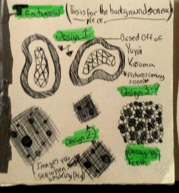
Textures: (This is for the backgrounds on each piece)
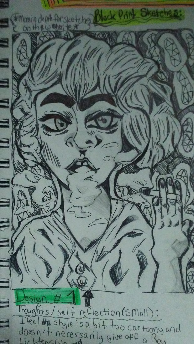
Design 1: Based off of Yayoi Kusama.
Design 2: Suppose to be a dizzy. Images you see after smoking (becoming high)
Design 3: Decaying teeth, for background.
|
To the left is a small doodle after I planned each sketch. I was jotting down small notes I could reference to later when sketching, I wanted to see how I should add the backgrounds in each sketch. For the first sketch, I based it off of Yayoi Kusama (her style of drawing illustrations). For the second design, I wanted to make the background give off a dizzy affect, so I added several lines and dots (different sizes). Finally for the third design, I wanted to base it off of the affects of smoking, so I wanted the background to look like decaying teeth.
|
|
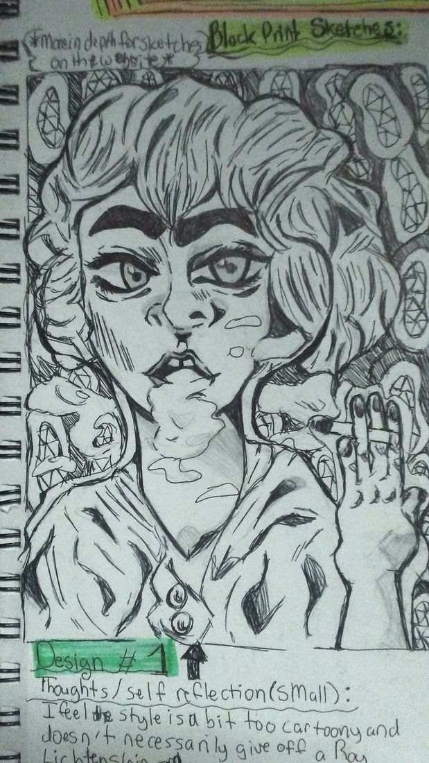
Sketch 1:
From the beginning of the project, I knew I wanted to base my theme around "Addiction". Within each sketch, I wanted to show a smoking addiction basis of each piece, and build my ideas from several art movements. For the first sketch, I wanted to base this piece off of Max Beckmann (Quappi in the pink Jumper), and Roy Lichtenstein (Nurse). Eventually, I ended going with this sketch as my final design. |
|
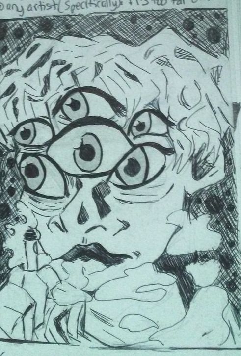
Sketch 2:
My second sketch is more of a reincarnation from the first one I created. I was researching some more German Expressionist block prints, and I stumbled upon a more recent designer named Angie Hoffimeister. I decided to add more of a "trippy" affect, hence me creating more eyes around the face in order to slightly include her art style. I still kept the same theme throughout sketching, but I wanted to add something different to the background. I wanted to give off a dizzy affect, so I added more lines and dots to cause the eyes to waver around. |
|
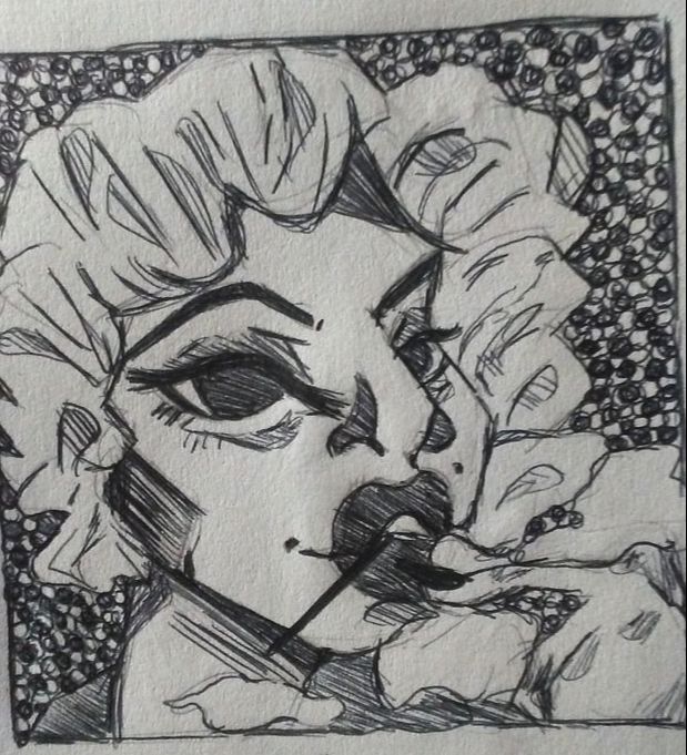
Sketch 3:
For my third sketch, I wanted to give off more of a Pop Art look, minus the somber eyes in German Expressionism pieces. The main piece I referenced from was Marilyn Monroe by Andy Warhol. I loved the way her hair looked free and loose, so I thought I it would be a good block print idea. I still wanted it to connect with the theme "Addiction", so I thought to keep the overall look of all my other sketches, and make her look like she's smoking. I didn't want to have such a broad theme, so I decided to narrow it down. |
My Theme:
|
The theme I chose for this project is Addiction, which is best explained as things people are addicted to for example: smoking, drinking, gambling, etc. I choose this theme because I wanted to challenge myself into creating several different pieces conveying a similar message. Now reflecting how difficult it was thinking of an idea, I plan on changing my theme in the next project into something a bit easier.
|
The description underneath the sketch is me reflecting on what I like and don't like about it.
|
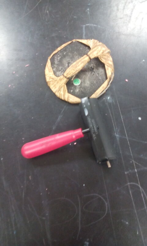
Tools Used:
(Click on to see name of tools)
Process:
|
*Click to enlarge slideshow process*
Process:
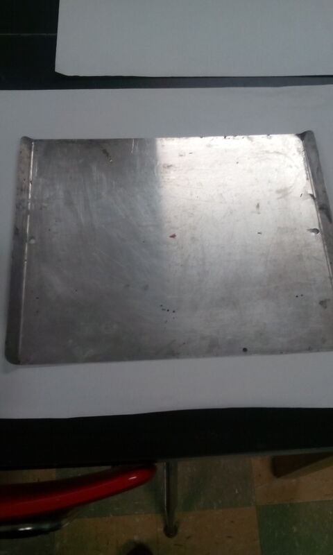
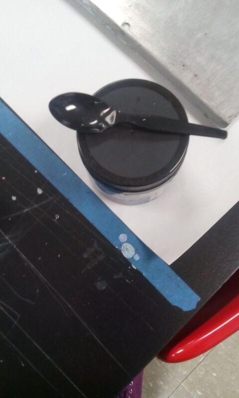
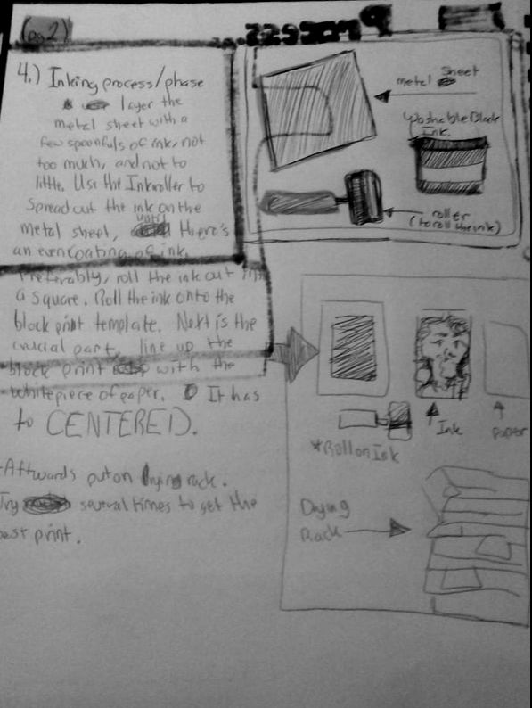
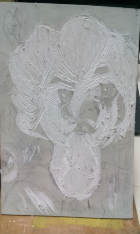
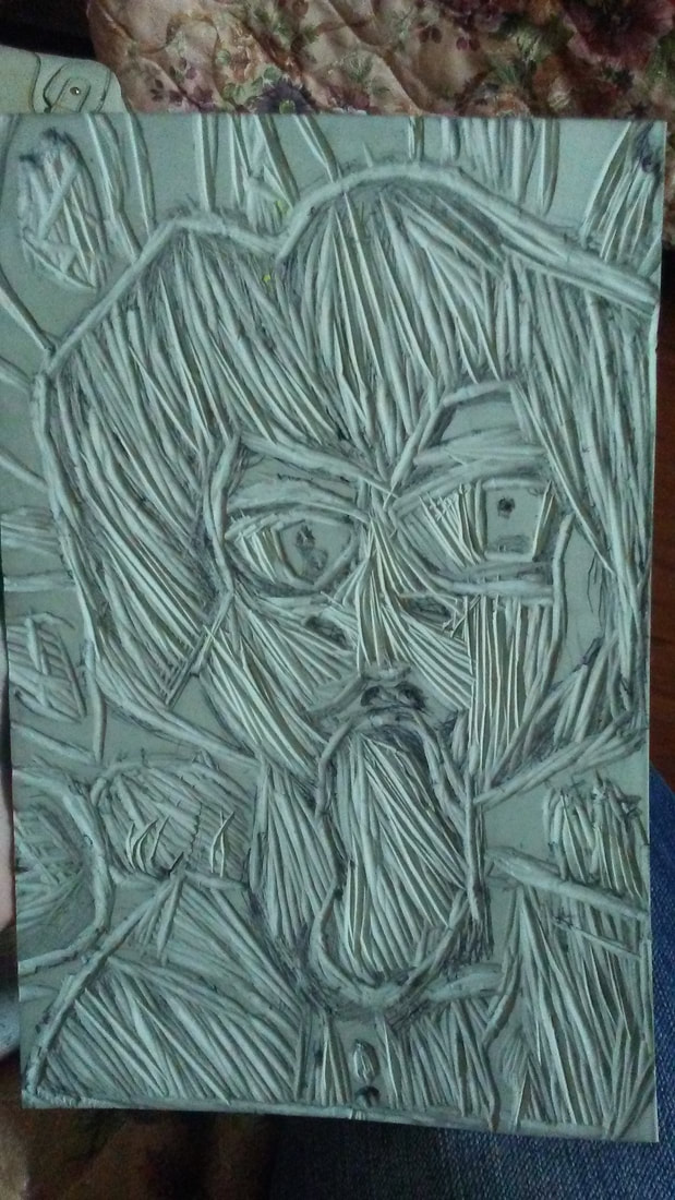
First I redrew the sketch on another piece of paper. I used the block print to outline how big my drawing was going to be. After I was finished with drawing my sketch, I used the graphite transfer method, meaning I layered the back of the drawing with graphite, then traced the image on top of the block print. I also decided to retrace over areas where the lines didn't show up. Then, I started carving using the Linoleum cutting tools, leaving certain spots black and certain spots white. This was the longest step in the process, due to the amount of precision/accuracy I wanted my print to look like ( the first two pictures to the left shows my carving process). Finally, I went on to the inking phase (the third image next to the carved block prints is what the image looked like filled with ink. The images above are the tools I used for the inking). I was cautious towards how much ink I should add on the metal sheet, then using the roller, I would roll the ink out till it leaves off an even coating. After centering a white piece of paper (to the best of my ability), I set a piece of newsprint paper underneath, and started to rub it using the bamboo Barren with an even amount of pressure. After 4 minutes of rubbing, i slowly removed both pieces, and I set the block on the drying rack. |
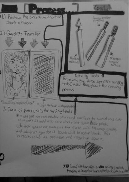
pg 2. of sketchbook process outline
|
|
*Click to enlarge slideshow experimentation*
|
Experimentation:
The pictures to the left are filled with my trials of the printing phase. Throughout the inking process, I was trying to decide how much ink I wanted on the Block Print. There would be times during the inking phase, I would go back and add more detail to get a slightly different print. The first time I started the process, I didn't add not enough ink to the template, so the image didn't capture all of the details. This resulted in the first three images you see. I didn't want all of my detail to be covered, so I was reluctant to add more ink. Towards the last two images, I decided to add more ink to my templates, overall making the image look better. I was happy with the with the way the last two images turned out, making it hard for me to choose which one I wanted as my final. In the end, I choice the last piece as my final block print. |

Reflection::
The overall piece came out to be quite a success in my opinion. I felt as though I could have done a better job in carving out the hand, since there isn't as much detail. For printing, I felt in the beginning I should have added a bit more ink instead worrying of adding too much. The prints before turned out light and hard to make out. Although I had trouble, repeating the process but changing a few derails at a time truly help me create better prints. Looking at my final outcome, I wished I would have add some sort of watercolor to add more depth. I wanted to separate parts of the block print, or add more emphasis on certain parts. I felt I should have been more courageous with my work, and try new things!
I've noticed when researching that majority of the information came from my art history sketchbook last year. I saw how in majority of the German Expressionist paintings, the people had solemn eyes with several bags underneath them, but for Pop Art paintings, their eyes would be larger and filled with color and outlines. I wanted to contrast between the two, by adding bags in my piece along with big cartoony eyes. I've also noticed as the hair within German Expressionism isn't as detailed (more so can be identified in one shape) as Pop art paintings, so I decided to highlight the Pop Art in the hairstyle. The research I gathered between these two movements, give off two different atmospheres when glancing at them.
I've noticed when researching that majority of the information came from my art history sketchbook last year. I saw how in majority of the German Expressionist paintings, the people had solemn eyes with several bags underneath them, but for Pop Art paintings, their eyes would be larger and filled with color and outlines. I wanted to contrast between the two, by adding bags in my piece along with big cartoony eyes. I've also noticed as the hair within German Expressionism isn't as detailed (more so can be identified in one shape) as Pop art paintings, so I decided to highlight the Pop Art in the hairstyle. The research I gathered between these two movements, give off two different atmospheres when glancing at them.
|
|
Compare & Contrast
Similarities:
Differences:
|
Final Piece
|
ACT Responses:
Clearly explain how you are able to identify the cause effect relationship between your inspiration and its effect on your artwork?
While researching, I saw how dark and thick the Pop artist Roy Lichtenstein and German Expressionist Max Beckmann used in their work. Although, Max Beckmann's reasoning towards the matter is to illustrate bitterness within his work, specifically with the darker areas around the eyes.
What is the overall approach the author has regarding the topic of your inspiration?
The author's regarding German Expressionism didn't go into depth and only recapped what the original artist have already claimed. For Pop Art, multiple authors claimed that movement to be challenging and represented mainly comic books/advertising.
What kind of generalizations and conclusions have you discovered about people, ideas, culture, etc, while you researched your inspiration?
Due to the darkness (mainly consisting the colors of black and white) German Expressionism was more of a dull and sorrow time, but it contrasts with the bright and colorful Pop Art which shows more joy.
What is the central idea or theme around your inspirational research?
The central idea was false reality, meaning certain things may feel good, but are not good for you. This is what my theme Addiction is based around.
What kind of inferences did you make while reading your research?
I can infer that Pop Art was more of a glamorous and fun way to express art, while German Expressionism expressed struggles and suffering in their artwork.
Bibliography:
“Spain Is Culture.” Quappi in a Pink Jumper , National Thyssen-Bornemisza Museum, Madrid at Spain Is Culture., www.spainisculture.com/en/obras_de_excelencia/museo_thyssen-bornemisza/quappi_con_sueter_rosa.html.
“Nurse (Lichtenstein).” Wikipedia, Wikimedia Foundation, 17 Nov. 2018, en.wikipedia.org/wiki/Nurse_(Lichtenstein).
Jarvis, Stephan, et al. “Yayoi Kusama: My Eternal Soul.” Tokyo Weekender, 6 Sept. 2019, www.tokyoweekender.com/events/yayoi-kusama-eternal-soul/.
“Nurse (Lichtenstein).” Wikipedia, Wikimedia Foundation, 17 Nov. 2018, en.wikipedia.org/wiki/Nurse_(Lichtenstein).
Jarvis, Stephan, et al. “Yayoi Kusama: My Eternal Soul.” Tokyo Weekender, 6 Sept. 2019, www.tokyoweekender.com/events/yayoi-kusama-eternal-soul/.
