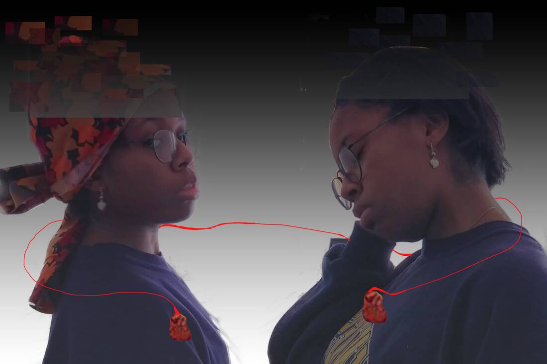
Project 3:
"A Throwback"
50cm x 76cm
Digital photo-manipulation
November 5, 2020
Exhibition Text:
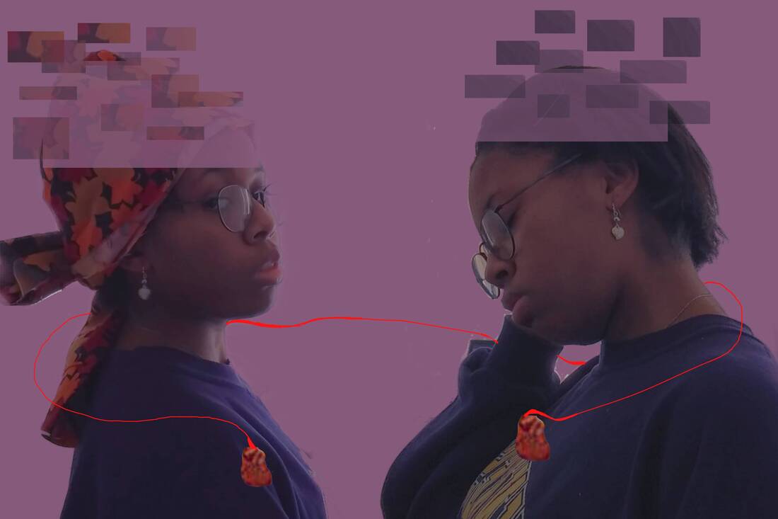
The piece "A Throwback" is inspired mainly from the complications mentally I've been having through quarantine. I feel myself being wired down and losing motivation to complete anything, hence is affecting me personally for inspiration. This digital collage is inspired by Human Emotions by Miroslav Zgabaj, The Girl with the Pearl Earring by Johannes Vermeer, and The Two Fridas by Frida Kahlo. This is more of a personal piece, and it is inspired by claustrophobia, as I'm feeling trapped.
Digital photo-manipulation
November 5, 2020
Exhibition Text:
The piece "A Throwback" is inspired mainly from the complications mentally I've been having through quarantine. I feel myself being wired down and losing motivation to complete anything, hence is affecting me personally for inspiration. This digital collage is inspired by Human Emotions by Miroslav Zgabaj, The Girl with the Pearl Earring by Johannes Vermeer, and The Two Fridas by Frida Kahlo. This is more of a personal piece, and it is inspired by claustrophobia, as I'm feeling trapped.
Planning:
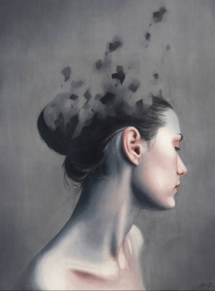
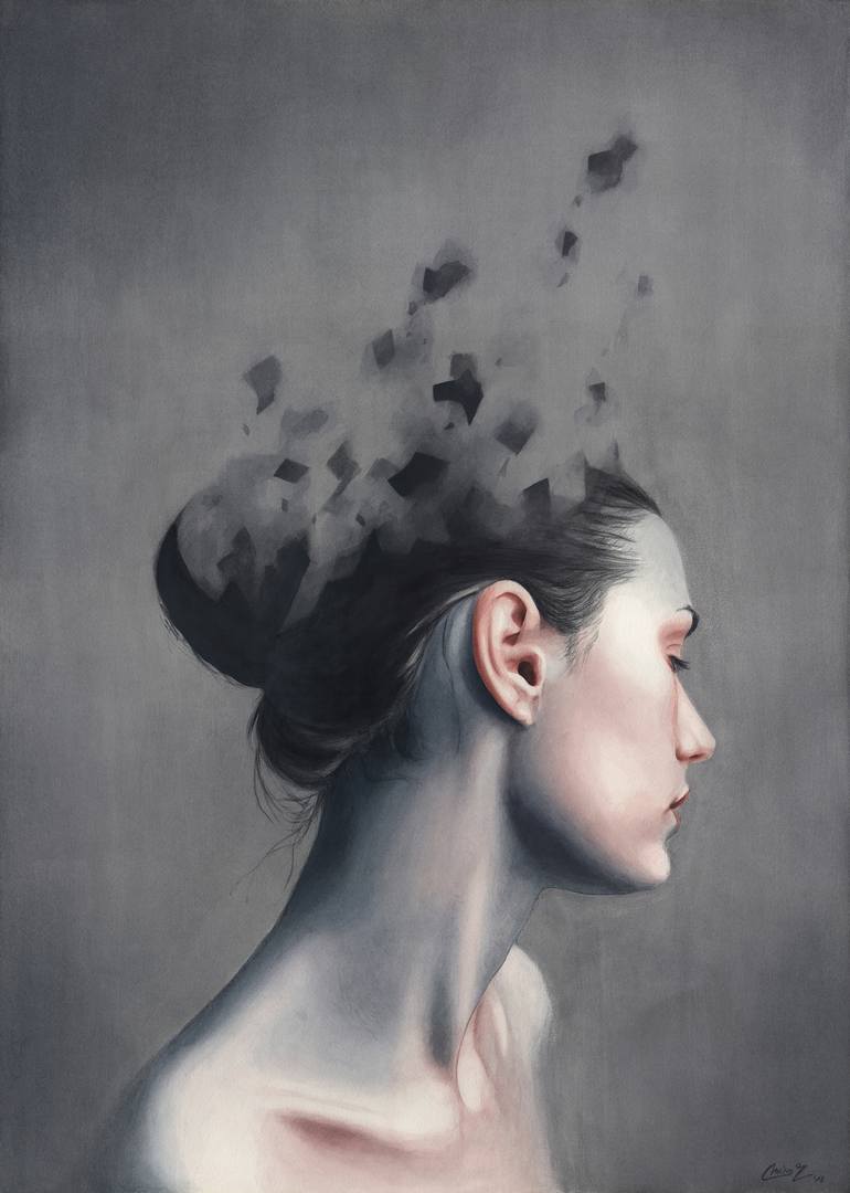
Human Emotions Miroslav Zgabaj 2019
|
Inspiration:
I decided to look back towards more modern contemporary artist for my main inspiration, and this watercolor illustration by Miroslav Zgabaj titled Human Emotions looked interesting scrolling through Pinterest. What I found to be the most interesting about the piece is how the top portion of the woman is fading away or moving around like debris. By analyzing this watercolor painting, this looks to demonstrate more of a negative emotion, as the color choice (palette) of the piece is filled with grays and blues. The blue shadows to me represent more of a solemn mood, and there are barely any warm colors displayed in the piece (and even so it looks muddy compared to all the grays and blacks it's being mixed with). I also like the contrast between the texture in the piece, as the debris (particles) of the hair look sharp and jagged, but the skin and other facial features of the woman looks soft and smooth. I plan to incorporate this illustration into my final piece is having the top portion of both of my photos have a similar faded debris aesthetic just like this watercolor illustration. |
|
The painting "The Two Fridas" by Frida Kahlo interested me because of how simplicity the painting looks. The painting's meaning is to display "separation" and "loneliness", as both of the Frida's in the painting are holding hands for comfort. The contrast and value of colors are quite low, as there isn't a variety within the color choice of the piece. The background's color choice is filled with different shades of grays (ranging from dark to light) and the figures look like they're in a shadow. The expressions on the women face look blank and emotionless, which shows lack of any movement. Looking at this piece, I plan to incorporate the hearts from the chests and the red line attached to each (figure out a way to wrap the line around each photo).
|
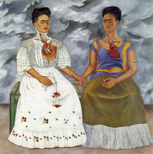
The Two Fridas Frida Kahlo, 1939
|
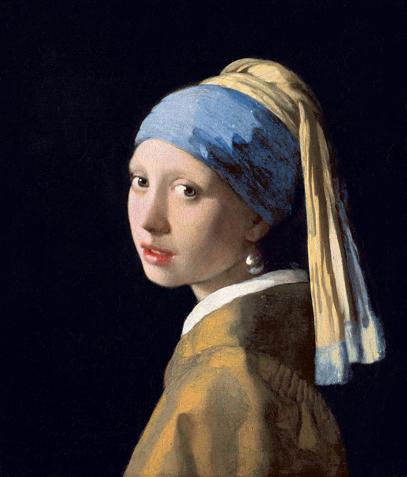
The Girl With The Pearl Earring Johannes Vermeer 1665
|
The Girl With The Pearl Earring by Johannes Vermeer looked inspiring to me because of the pose and clothing of the woman in the painting. I liked the overall fashion style of the woman in this piece, and how "glamorous" she looks (her skin and facial features look innocent and mellow). Looking at the painting, I appreciate the subtle emphasis on the pearl earring the woman is wearing, as it's very shiny and has a great amount of detail. There's also a nice balance in the colors used, as they seem intentional and the darker shadowed colors blend in well with the lighter colors (face, head wrap cloth, the pearl earring, and top portion of shirt). I plan to use the overall look of the piece (the pose and somewhat clothing style) to emphasis on a more "fashionable" look compared to the other figure in the lensed-based project.
|
Sketches:
|
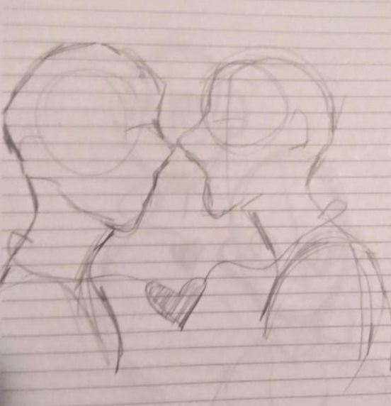
Sketch 1:
For all of my planning sketches, I wasn't planning to make any of them "hyper-detailed" as my overall goal was to sketch out poses for my photoshoot. These sketches were mainly produced on lined notebook paper. This first sketch however was me trying to display a different pose for the lensed-based edit. I was originally thinking of having both of the photos facing directly at each other, with the heart in the middle having both of the red lines connect to it. |
|
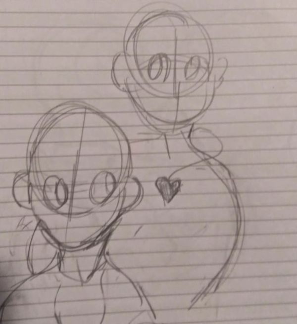
Sketch 2:
For this sketch, I wanted to experiment more with the poses, and I wanted to casually draw one figure behind the other. I tried to make it seem as though they are looking at opposite directions from each other or off to the side. I wasn't really sure of what angle I was going with this drawing, but I still decided to keep the heart in the middle of the drawing. I tried to connect the lines together from different sides of the body. |
|
|
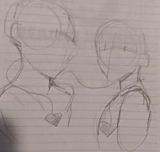
Sketch 3:
To make my process for the photo shoot easier, I decided to directly look at the references for the photo and sketch from there. I placed the hearts for in a similar chest position, and tried to tie the wires around the necks of each figure. This sketch made me the happiest, so I kept this drawing and I started my photo shoot afterwards to best match this sketch. |
Process:
|
|
Process:
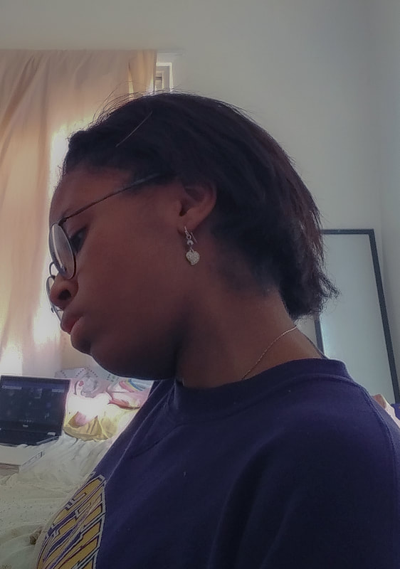
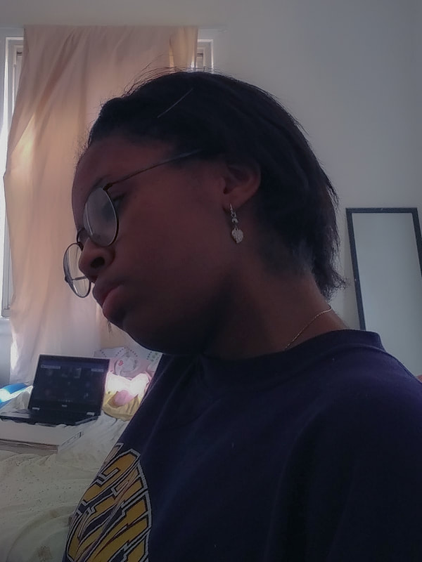
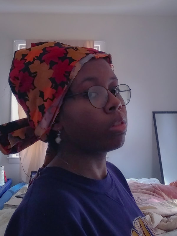
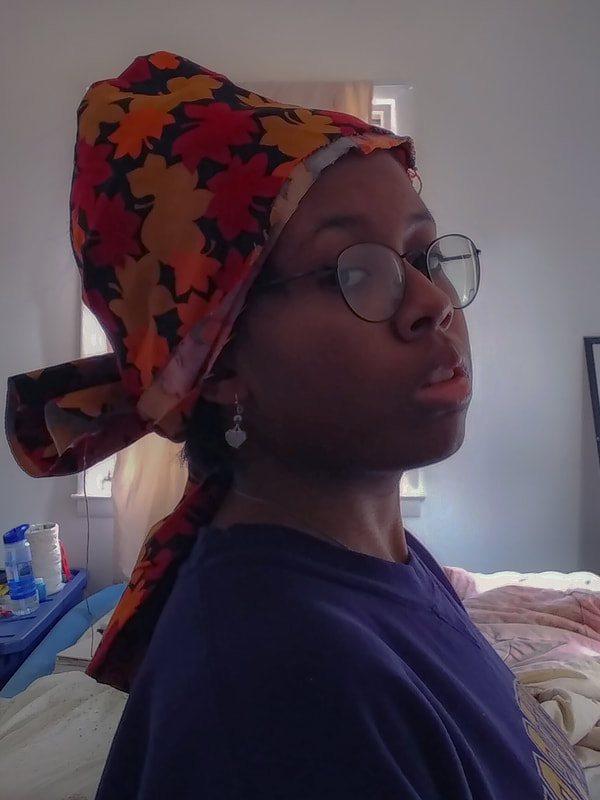
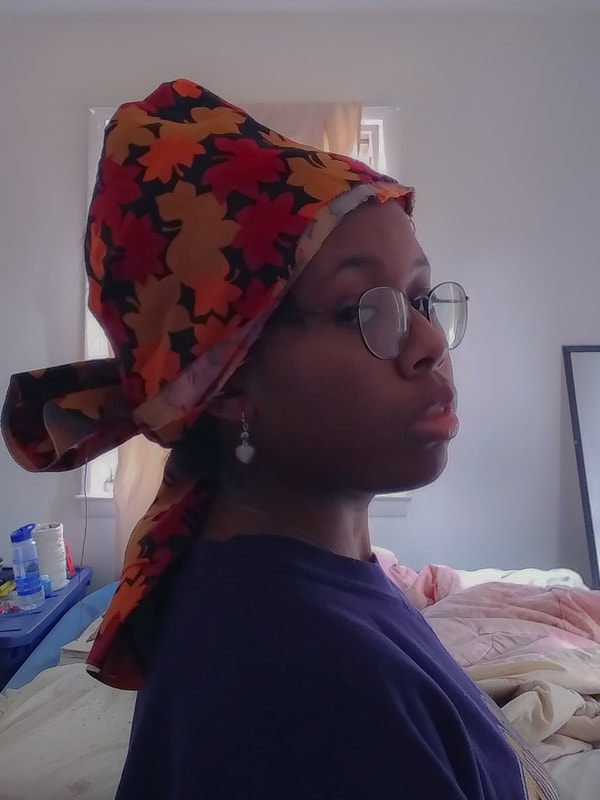
I decided to plan a photo-shoot for myself, and pick out which photo best matched my sketch and the inspiration pieces above. In the beginning, I decided that I would have a total of three photos for each separate pose, and choose which one I liked the most from there. For the first pose, I wanted to tilt my head to the side and capture a pose of me looking down to someone/something. I kept trying to tilt my head to the right, but after awhile my neck got sore. I decided to choose the third picture since I feel as though it gave off the best representation. For the second pose, I had a head scarf in my room, so I decided to tie it around my head. I tried my best to match my outfit with the pose of the painting. I even found my dangling pair pearl earrings. My goal for this pose was to angle myself in a position as I am looking at the camera at a titled angle while raising my eyebrows. I was more happy with the choices I had to choose from in for this photo shoot rather than the other one because these matched my inspiration the best. I decided to choose my last option to edit in photoshop. |

|
Process for Photoshop:
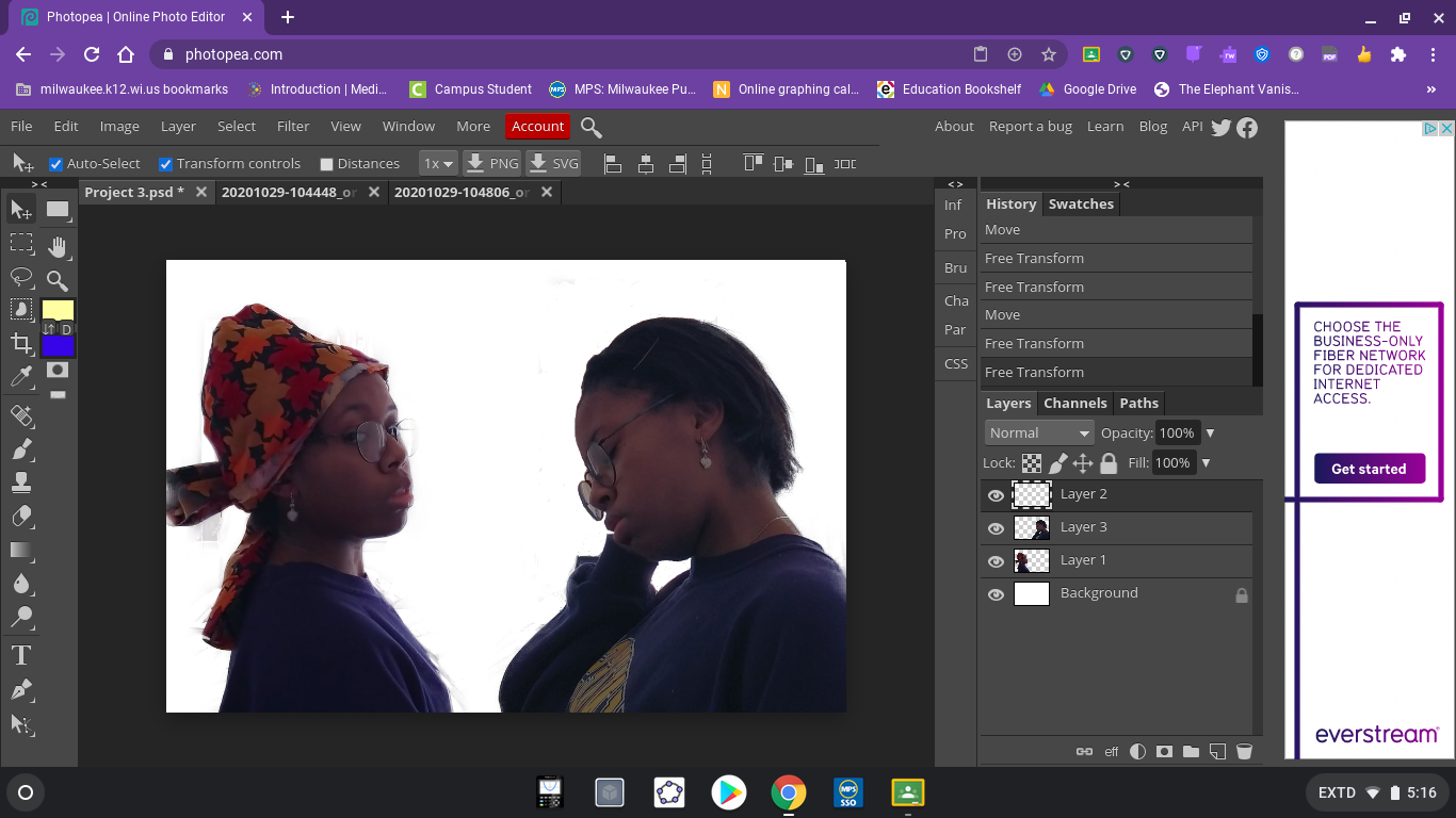
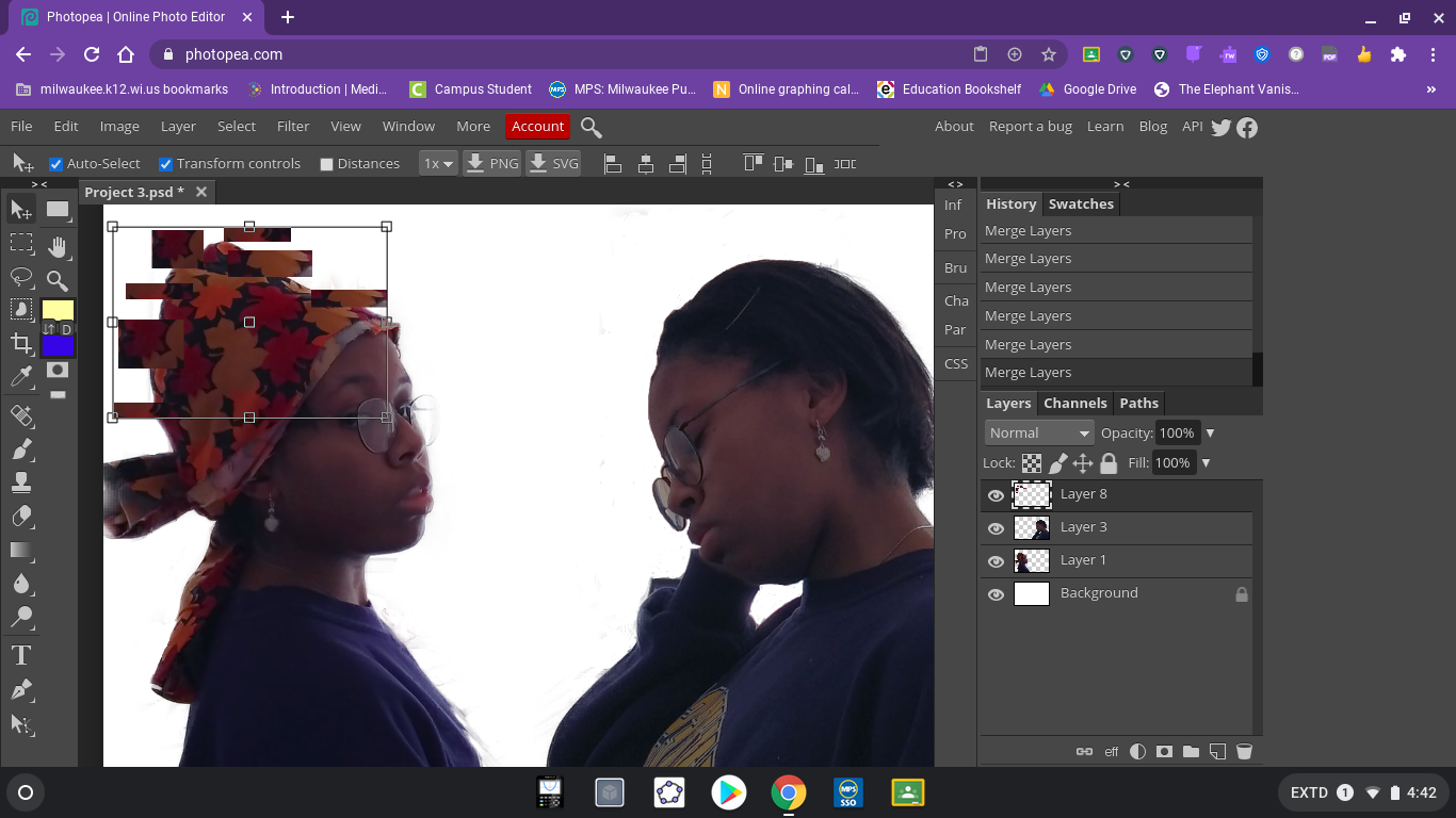
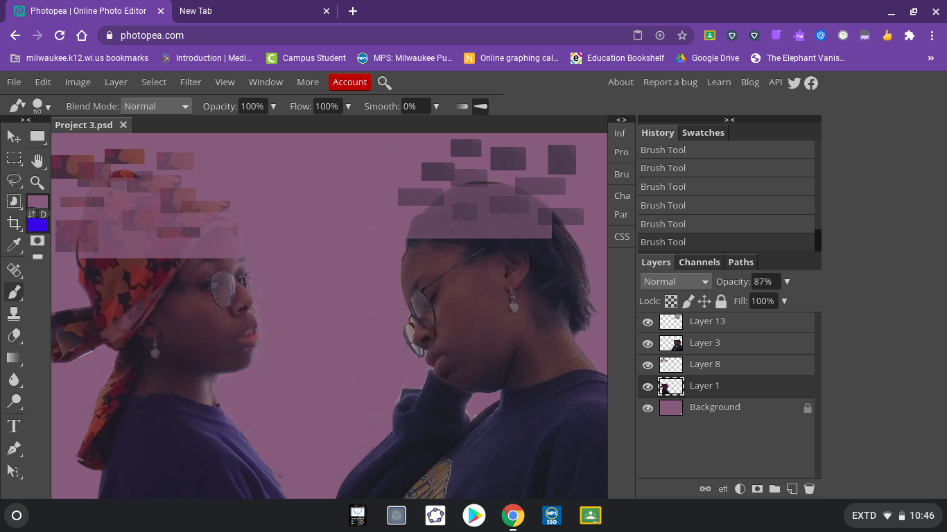
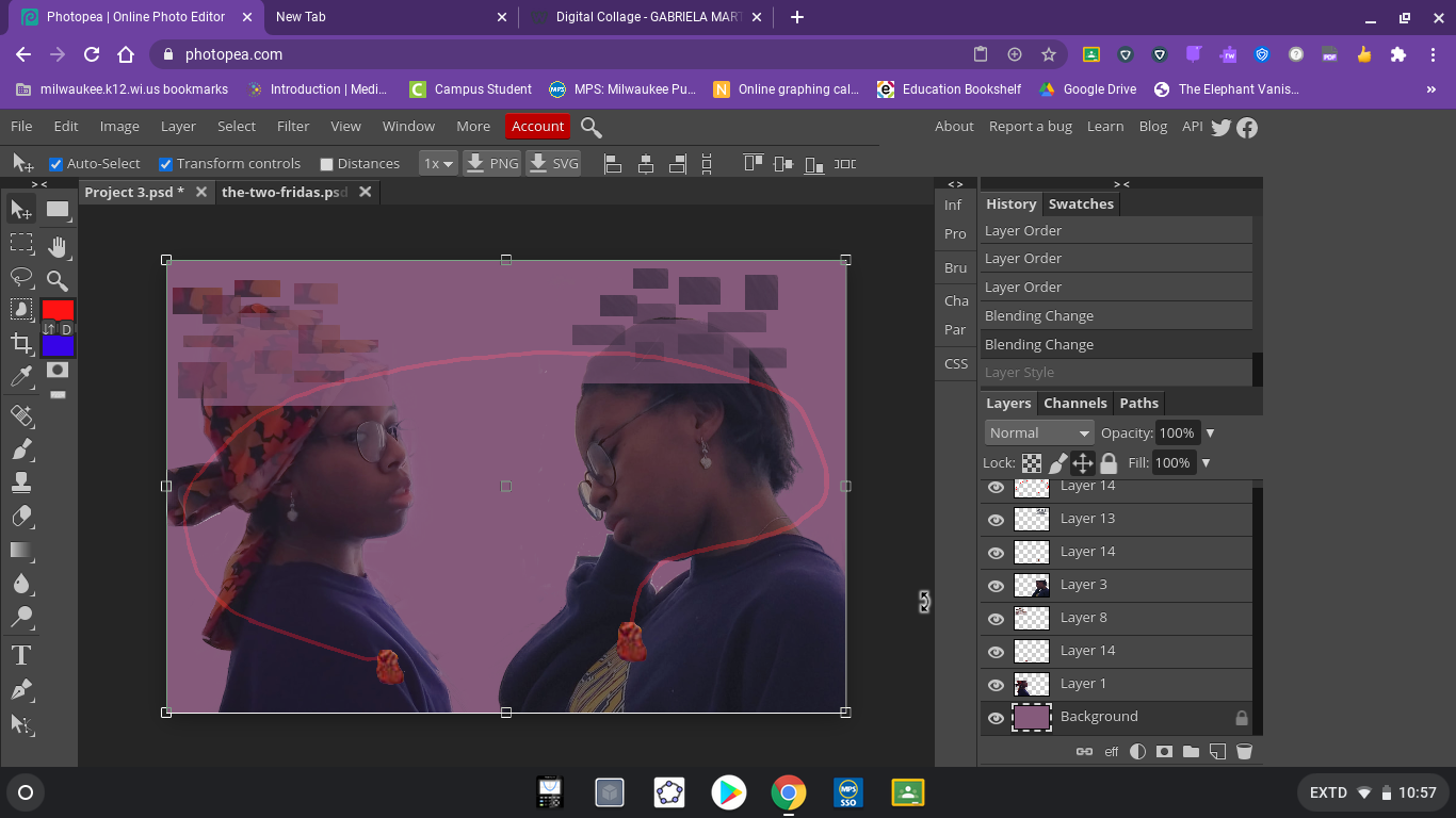
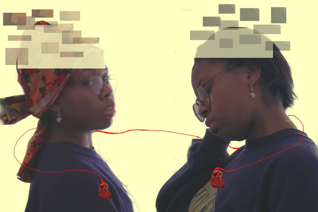
When I picked out the photos for my, I started to set up the file I'll save my progress on. I set the size of the file to 50cm x 76cm, 50cm for the height and 70cm for the length. Secondly, I uploaded the images I planned on using for the digital edit. I separated the images into two different layers, and I cleared out the background for both of them. After I cleaned up the edges, I placed the images on a clear background to see if I needed to touch up on anything else. When everything seemed up to par, I started copying and pasting small portions of the top of both heads and alternating the shapes into small block like patterns. I changed some of the sizes of the blocks, some long and rectangular, and others small square shaped. Once the debris like pattern was created, I cleared out the top head shape of both images and lowered the opacity levels to give off the allusion that the image is fading away. I colored in the background of the image a pale red-velvet color to make the images pop out more. Once each part of the design was complete, the last thing to finish was adding in the hearts to the image a drawing in a red line to connect both of them. I edited the heart shapes and cleaned up around the image, after I duplicated the heart and added the hearts to both sides. Finally, I drew out a red line to connect both the hearts together around the necks of both of the figures. |
|


|
|
Experimentation:
During the project, I wasn't sure which what color to choose for the background. At first I wanted to use a red-velvet color, but I decided to experiment with other tools on the photoshop. I tried testing out the gradient tool to see how it would look like, so the two colors I used were black and white. I didn't like the background colors merging in with the figures, and it made the overall design look more dull and disgusting which wasn't much of my intent for my photo manipulation. I used other colors for the gradient tool, but regardless I didn't like the way they look. I later tried using a lighter color to make the figures pop out more, but I felt that the background would bring more attention rather than the photos in the piece (because of how bright it is). The last thing I wanted to experiment with is how the red rope would be tied together, more so in which direction it's going. At first I wanted the line to be thrown above and looped around both of the heads of the images. Looking back on it, I felt it looked sloppy and unpolished, as it goes through most of the images. I decided to settle on tying the red rope on both of the images necks. |

Human Emotions Miroslav Zgabaj 2019
|
The Two Fridas Frida Kahlo, 1939
The Girl With The Pearl Earring Johannes Vermeer 1665
|
Compare & Contrast:
Similarities:
|
Final Piece
|
Reflection:
Critique:
This project overall I felt was entertaining to create, and I enjoyed polishing the final product. While I was creating this piece, the main struggles I had at first was figuring out where to place the images, and how large to make each edit. Trying to size my images correctly was difficult because I tried making the images larger without losing the resolution of the image, as I'm trying to blow the image up larger (what helped better with the resolution was editing the photos in a photo filter as it made the images look clearer before editing them more). Another challenge I had was drawing out the red line to connect the hearts because firstly my computer kept freezing on me, so this resulted in me constantly re-drawing my line, and secondly I struggle drawing using a mouse instead of a stylus (it made my fingers feel more uncomfortable). I also liked executing the photo-shoot (I found that part to be the most fun since trying to match my face to the pose of the paintings to be enjoyable). In the end, I loved making this digital edit, and although there isn't much complaints I have about the final product, I still enjoyed the process.
This project overall I felt was entertaining to create, and I enjoyed polishing the final product. While I was creating this piece, the main struggles I had at first was figuring out where to place the images, and how large to make each edit. Trying to size my images correctly was difficult because I tried making the images larger without losing the resolution of the image, as I'm trying to blow the image up larger (what helped better with the resolution was editing the photos in a photo filter as it made the images look clearer before editing them more). Another challenge I had was drawing out the red line to connect the hearts because firstly my computer kept freezing on me, so this resulted in me constantly re-drawing my line, and secondly I struggle drawing using a mouse instead of a stylus (it made my fingers feel more uncomfortable). I also liked executing the photo-shoot (I found that part to be the most fun since trying to match my face to the pose of the paintings to be enjoyable). In the end, I loved making this digital edit, and although there isn't much complaints I have about the final product, I still enjoyed the process.
ACT Responses:
Clearly explain how you are able to identify the cause effect relationship between your inspiration and its effect on your artwork.
The piece "A Throwback" is inspired by the my three pieces of inspiration because of the angles and poses of both of the figures, the faded top portion of each part of the the digital collage, and the red string to attach them together (to show the relationship between calmness and regret).
What is the overall approach the author has regarding the topic of your inspiration?
For the first piece, the artist's approach towards the painting is to covey human emotions (specifically negative emotions). The second piece, the artist displays more of an innocent and glamorous style to the painting, as it is just a woman looking directly to the viewer. Lastly, the third piece represents two different personalities, as in two different perspectives.
What kind of generalizations and conclusions have you discovered about people, ideas, culture, etc. while you researched your inspiration?
I can conclude from my inspiration that darker colors or gray-like dull colors are most favorable when it comes to shading in art.
What is the central idea or theme around your inspirational research?
My overall theme for this piece is "claustrophobia", which represents my thoughts of being in quarantine as I feel mentally drained.
What kind of inferences did you make while reading your research?
Some inferences I made during my research is that majority of the artists use more toned gray hues when painting which gives off a shadow like vibe. Another inference I made when looking at my inspiration is that in each of the drawings, the faces look either emotionless or stern.
Bibliography:
“Girl with a Pearl Earring.” Encyclopædia Britannica, Encyclopædia Britannica, Inc., www.britannica.com/topic/Girl-with-a-Pearl-Earring-by-Vermeer.
“Girl with a Pearl Earring.” Wikipedia. Wikimedia Foundation, September 29, 2020. https://en.wikipedia.org/wiki/Girl_with_a_Pearl_Earring.
Search by Muzli, n.d. https://search.muz.li/MTk0NGU4ZDA5.
The Two Fridas, 1939 by Frida Kahlo, www.fridakahlo.org/the-two-fridas.jsp.
“Girl with a Pearl Earring.” Wikipedia. Wikimedia Foundation, September 29, 2020. https://en.wikipedia.org/wiki/Girl_with_a_Pearl_Earring.
Search by Muzli, n.d. https://search.muz.li/MTk0NGU4ZDA5.
The Two Fridas, 1939 by Frida Kahlo, www.fridakahlo.org/the-two-fridas.jsp.
