Project 4:

|
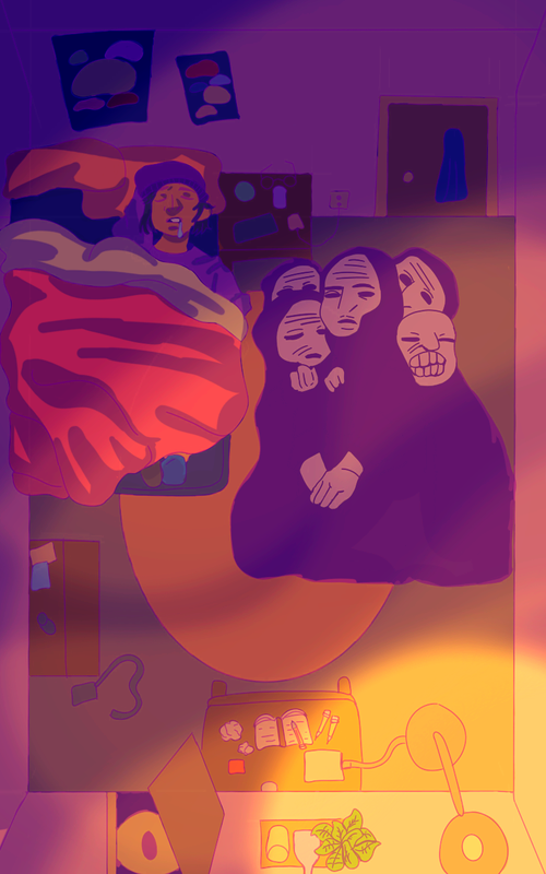
"Four Corners on a Square"50.8cm x 76.2cm
Digital Illustration December 3, 2020 Exhibition Text: This piece "Four Corner on a Square" was inspired by both the pieces Colossal by Felicia Chiao, and The People (Das Volk) Kathe Kollwitz. The purpose of this piece is more personal, as of lately I've been hallucinating and seeing figures in the dark, and this brought me back to my childhood as I would be afraid of seeing monsters in the night, resulted in me sleeping with a lamp on all night. I decided to base this piece on the phobia Teraphobia, as the definition is "fear of monsters". |
Planning:
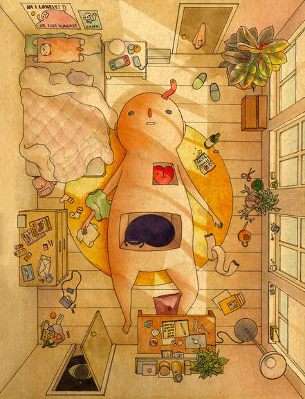
Colossal Felicia Chiao 2020
|
Inspiration:
This bedroom illustration named Colossal by Felicia Chiao influenced my thought process for my digital illustration is by how simple and cartoon wise the drawing looks in general. In all of Felicia Chiao's work, there is the same big figure in the middle of her drawings in every other piece she makes, which I also found to be very interesting about her art style. The brightness of the photo gives off a summer like (or spring, sometime warm) feeling as regarding the sun shining through the windows. I enjoy looking at the thin line art for each of the figures in the image, especially the bed and objects on the desk (there isn't much detail to them, but you can make out what the figures are). Looking at Felicia Chiao's other works, the all have a consistency in similar warm color hues, and thin line work. The contrast between the dark and light hues is well blended, as the dark hues don't overwhelm or take other the image entirely. I plan to incorporate this drawing into my final piece is by having similarly the same top view background style (as the bedroom view is towering in perspective. Another part of the image I enjoy entirely). The only difference I plan to make is change the time of day in which the drawing takes place in (comparing day to night/dusk to dawn). |
|
The People (Das Volk) by Kathe Kollwitz is a block print design made during the German Expressionism art movement. The People ironically is a direct English translation from German, as the original title of this piece is Das Volk. This piece intrigued looking at how all of the faces are pressed together, and analyzing the piece further, I've notice that not a single face is smile in this print. There is no sign of any joy-ish emotion, also considering that the entire print is in black and white. Both the colors black and white are bold in their on sense, and also considering that this piece contains more negative space than positive space. The shading tactic for this piece is also done in a cross-hatched fashion, which personally adds more contrast to this piece. I plan on using this image in my final piece by adding all of the meshed faces together, and overall making them look like a monster.
|
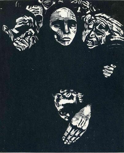
The People (Das Volk), Kathe Kollwitz, 1922
|
Sketches:
|
Sketch 1:
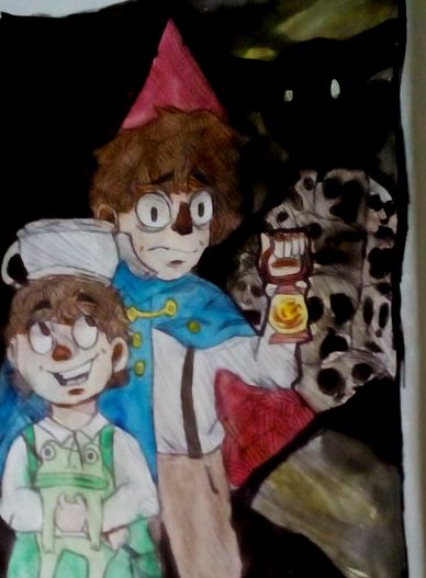
My first thought process for this piece was a cartoon show called "Over the Garden Wall" Watching this show inspired me to draw the characters in the dark with a monster behind them. I felt this drawing was great, but also not appropriate for what I'm trying to illustrate. I feel as though the meaning of Teraphobia (fear of monsters) would be lost as it's based on a cartoon show. Also, looking at the sketch again I feel as though this drawing doesn't show any resemblance to the two inspiration pieces above. |
|
|
Sketch 2:
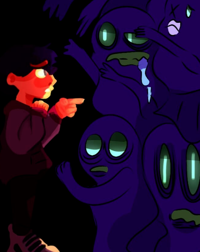
This sketch is more so on a more childlike perspective, as I wanted to illustrate child interacting with monsters. I had several different colored versions of this drawing, but I decided this drawing looked the most appealing. I digitally illustrated this sketch because I overall liked this idea at first, but after looking at the contradicting art style, I decided this wasn't the best style for this project. This sketch could have worked well with my theme, but I felt as though I could produce the image better and make it look more refined than this. |
|
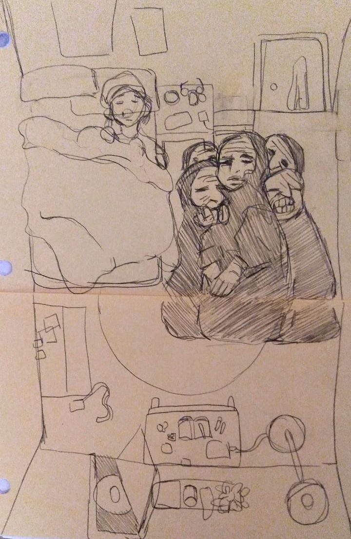
Sketch 3:
This sketch was a combination of both of the inspiration pieces I was looking at for my final piece. I decided to incorporate myself into the piece, and drew myself sleeping in bed. I wasn't sure whether I wanted to shade this piece in or not, but regardless I decided to just use pencil for this sketch compared to the others. I also tried to draw a somewhat accurate portrayal of my room, but also wanted to keep it similar to the inspiration as much as possible. |
|
Process:
|
Process:
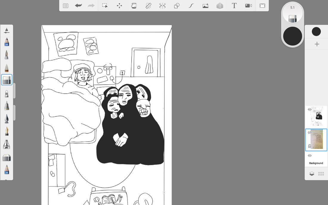
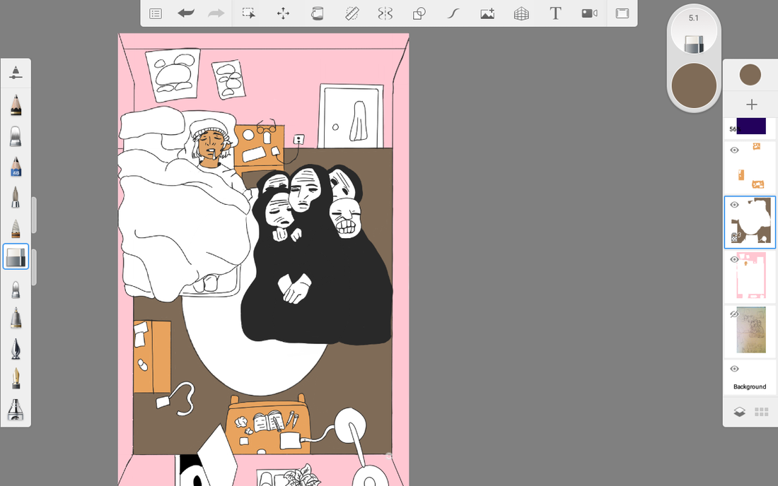
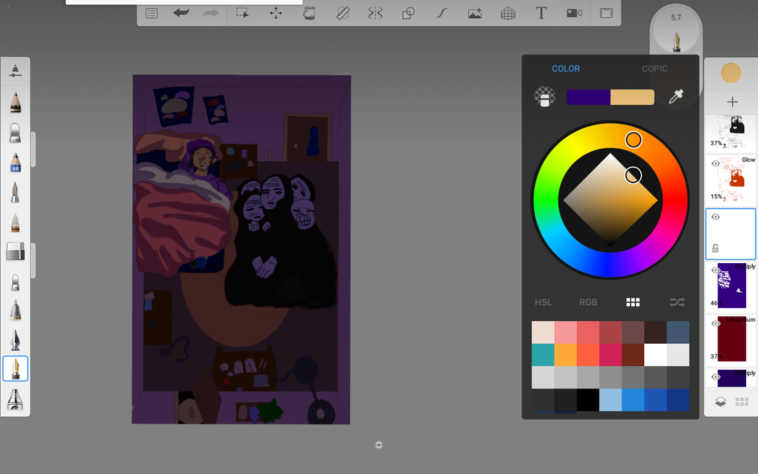
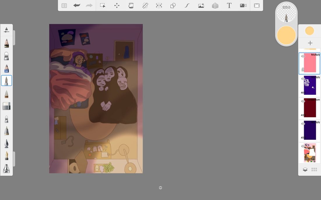
After my original sketch idea was completed, I uploaded the photo to Autodesk Sketchbook (the digital art software I use to illustrate my drawings). When on the site, I used the fine pen tool at 1.3 mm to outline the entire image in a new layer (I went back in certain areas to clean up my line work and add darker shadows when needed). When the outline of the completed, I started with the wall background first as this portion of this illustration took up majority of the piece. The color I chose for it was pink because I didn't want there to be too much white in my final product (the actual walls in my house are white, however I wanted to add more of a variety within my color palette of the piece). After I finished up coloring in the wall, I started coloring using the fountain pen tool, the smaller objects within the room (desk, lamp, blankets, etc), including my skin and clothes. When the entire color plotting process was finished, I was now able to shade in what was left. I first used the bucket tool and shaded in the entire background a dark purple hue (I tried to avoid using the color black at all this entire illustration when it comes to shading). Slowly on another layer, I started to shade in different parts of the illustration, trying my best to match my dark room itself. Towards the end, I started to duplicate layers add in more colored blocked images on lower opacity so it brighten or darker the room at my will. Doing this, I'm trying to give the drawing a colorful range to look back on. In the end of the digital medium, I drew more a light source coming from the lamp, and decided to make it brighten the room slightly (giving it a nice yellow-orange glow). |
|

|
|
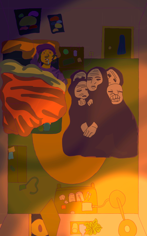
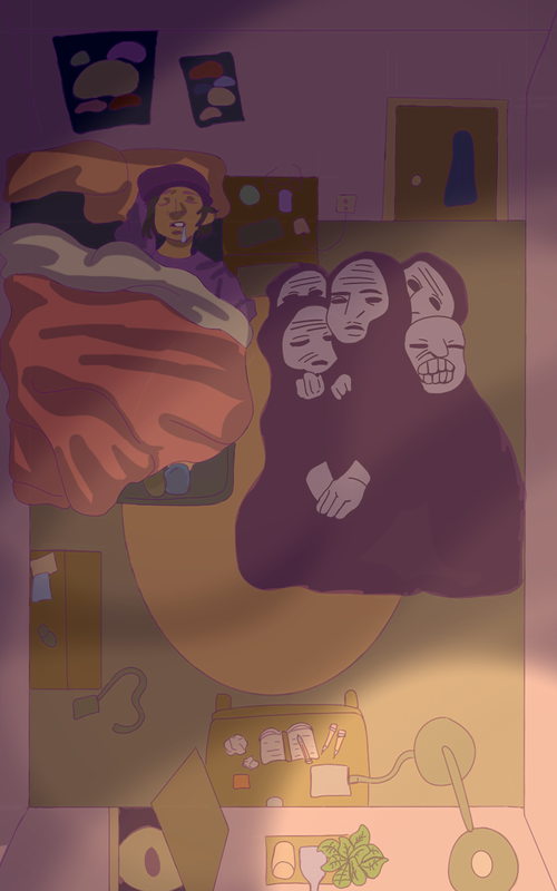
Experimentation:
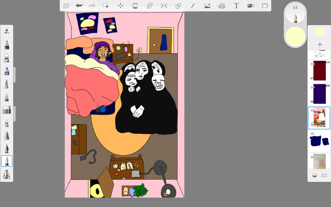
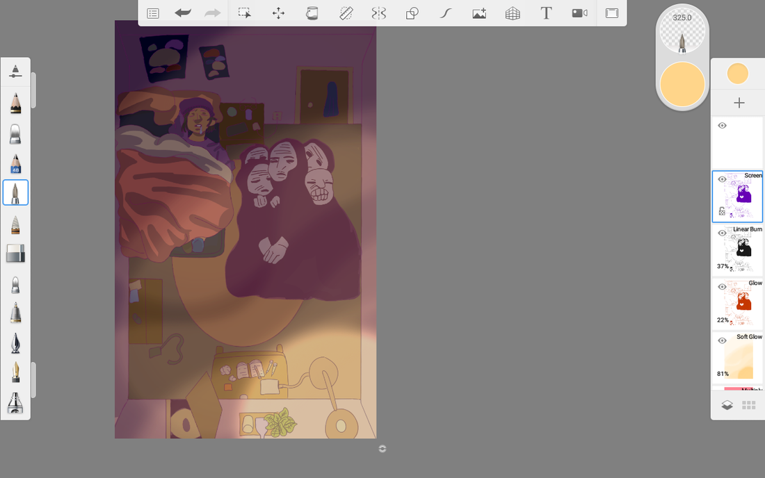
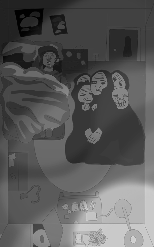
To the left here, I wanted to experiment with the different coloring style choices with my final product. In the first panel, I thought of trying to make the whole image in more of a "block print" style related to the German Expressionism. I decided that this would make the image look flat, and I planned on experimenting with different coloring techniques. The second panel has more contrast, as I was thinking of making the illustration look like a hallucination (fever dream). I added more purple and red hues to blend in with the background, with enhanced the blue shadows (using the layers "soft glow" and "screen", as was able to bring out the original colors and the outline of the piece. This helped make the shadows and highlights brighter than usual). Looking at this image at first I adored the color palette, but after analyzing the color choice more, I felt it was "too bright/saturated" so I changed that idea. The third image finally is a continuation of the last image, as I tried to make the colors seem slightly duller (I was testing the boundaries between too light and too dark using different layer options on Autodesk sketchbook). Overall, that was my least favorite experimented image, and lastly I kept the image the same. |
|
Colossal Felicia Chiao 2020
The People (Das Volk), Kathe Kollwitz, 1922
|
Compare & Contrast:
Similarities:
|
Final Product.
|
Reflection:
Critique:
The digital illustration four corners on a square so far is my favorite digital drawing out of all of my other projects, considering in this drawing I felt very comfortable drawing backgrounds. I was especially happy with how the colors turned out in the end, as they weren't too bright like my project 1, or too dull like my project 2 (I tried better to plan out my color palette before starting a drawing. Usually I would just color as I go and not really follow a guide, but I feel as though I've improved and plan on guiding out my colors more in the future. Although I like this piece very much, I do however have some faults I want to change to make this image look "a bit better". Firstly, I wish the shading in the room area looked slightly more accurate, as some parts look sloppily done and uncertain. My biggest concern however is some of the color in the monster portion of mondter portion of the piece is cut of, making the image look incomplete. It infuriates me looking at that now as I finished the product, but overall it isn't the worst mistake I've made digitally coloring something,
The digital illustration four corners on a square so far is my favorite digital drawing out of all of my other projects, considering in this drawing I felt very comfortable drawing backgrounds. I was especially happy with how the colors turned out in the end, as they weren't too bright like my project 1, or too dull like my project 2 (I tried better to plan out my color palette before starting a drawing. Usually I would just color as I go and not really follow a guide, but I feel as though I've improved and plan on guiding out my colors more in the future. Although I like this piece very much, I do however have some faults I want to change to make this image look "a bit better". Firstly, I wish the shading in the room area looked slightly more accurate, as some parts look sloppily done and uncertain. My biggest concern however is some of the color in the monster portion of mondter portion of the piece is cut of, making the image look incomplete. It infuriates me looking at that now as I finished the product, but overall it isn't the worst mistake I've made digitally coloring something,
ACT Responses:
Clearly explain how you are able to identify the cause effect relationship between your inspiration and its effect on your artwork.
This piece "Four Corner on a Square" reflects the phobia Teraphobia, meaning the fear of monsters (this piece reflects my childhood fears compared to the present).
What is the overall approach the author has regarding the topic of your inspiration?
The approach Kathe Kollwitz within her art style resembles despair and sadness, while Felicia Chiao seems as though shows more happiness and joy within her work as the color choice is more bright.
What kind of generalizations and conclusions have you discovered about people, ideas, culture, etc. while you researched your inspiration?
Conclusions I can make on the Kathe Kollwitz work is that it was made to represent her melancholy emotions, while Felicia Chiao tried to illustrate more of a humorous play.
What is the central idea or theme around your inspirational research?
The phobia Teraphobia is my overall theme in my final piece.
What kind of inferences did you make while reading your research?
I can infer that contemporary artists color more brightly, considering the contrast with German Expressionists (black and white).
Bibliography:
*, Name. “Felicia Chiao - 007.” WOW x WOW, 22 Mar. 2018, wowxwow.com/artist-profile/felicia-chiao-ap/attachment/felicia-chiao-007.
Staugaitis, Laura. “Anonymous Protagonists Navigate Imagined Worlds in Multi-Layered Illustrations by Felicia Chiao.” Colossal, 23 Jan. 2020, www.thisiscolossal.com/2019/11/multi-layered-illustrations-by-felicia-chiao/.
Kollwitz, Käthe. “The People Das Volk from Krieg Knesebeck 190 by KätheKollwitz.” The People Das Volk from Krieg Knesebeck 190 by Käthe Kollwitz on Artnet, Dorotheum, 1 Jan. 1970, www.artnet.com/artists/k%C3%A4the-kollwitz/the-people-das-volk-from-krieg-knesebeck-190-Zks1eZokZvPVmF8en5po7A2.
