Digital Illustration:
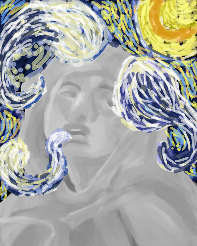
"A Starry Ecstasy"
50.8cm x 76.2cm
Digital Illustration on Foam Cord
February 12, 2020
Exhibition Text:
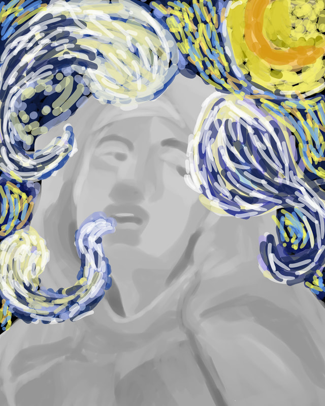
The piece "Starry Ecstasy" is inspired by both the Impressionist and Baroque art periods. The background of this piece is Starry Night by Vincent Van Gogh, which in this project represents the phobia "Claustrophobia", which is the fear of closed space. As presented, the woman is being closed off by clouds, and is gasping for air. The figure in the piece is the statue of the Ecstasy of Saint Teresa by Gian Lorenzo Bernini, which is the main inspiration for my artwork.
Digital Illustration on Foam Cord
February 12, 2020
Exhibition Text:
The piece "Starry Ecstasy" is inspired by both the Impressionist and Baroque art periods. The background of this piece is Starry Night by Vincent Van Gogh, which in this project represents the phobia "Claustrophobia", which is the fear of closed space. As presented, the woman is being closed off by clouds, and is gasping for air. The figure in the piece is the statue of the Ecstasy of Saint Teresa by Gian Lorenzo Bernini, which is the main inspiration for my artwork.
Planning:
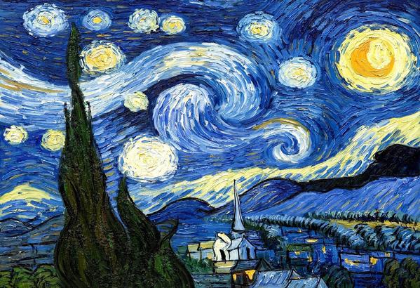
Starry Night (1889) Van Gogh
|
Inspiration:
I decided I want to manipulate the aspect of an Impressionist style background using digital art. Looking at Vincent Van Gogh impressionist work, I found Starry Night to be the most inspiring because I adored how colorful and precise the stripes are. I love how each color in the piece is visibly used, and is expressed through different parts of the painting. Each line is made with a different color, and I can see that the brush for some of the lines weren't cleaned before applying another. I enjoyed the movement this piece shows with the clouds swirling around each other in the background. I want my final piece to somewhat mimic the art style of Vincent Van Gogh, and copy the flow of his Starry Night. I plan to replicate some of the same colors he used for this piece, as well of some color choices of my own. I wanted to add some type of purple tint in the background along with the swirls. This relates to the theme of my project because I wanted the swirls to consume some of the figures space in the illustration, as to make the woman look like she is suffocating. |
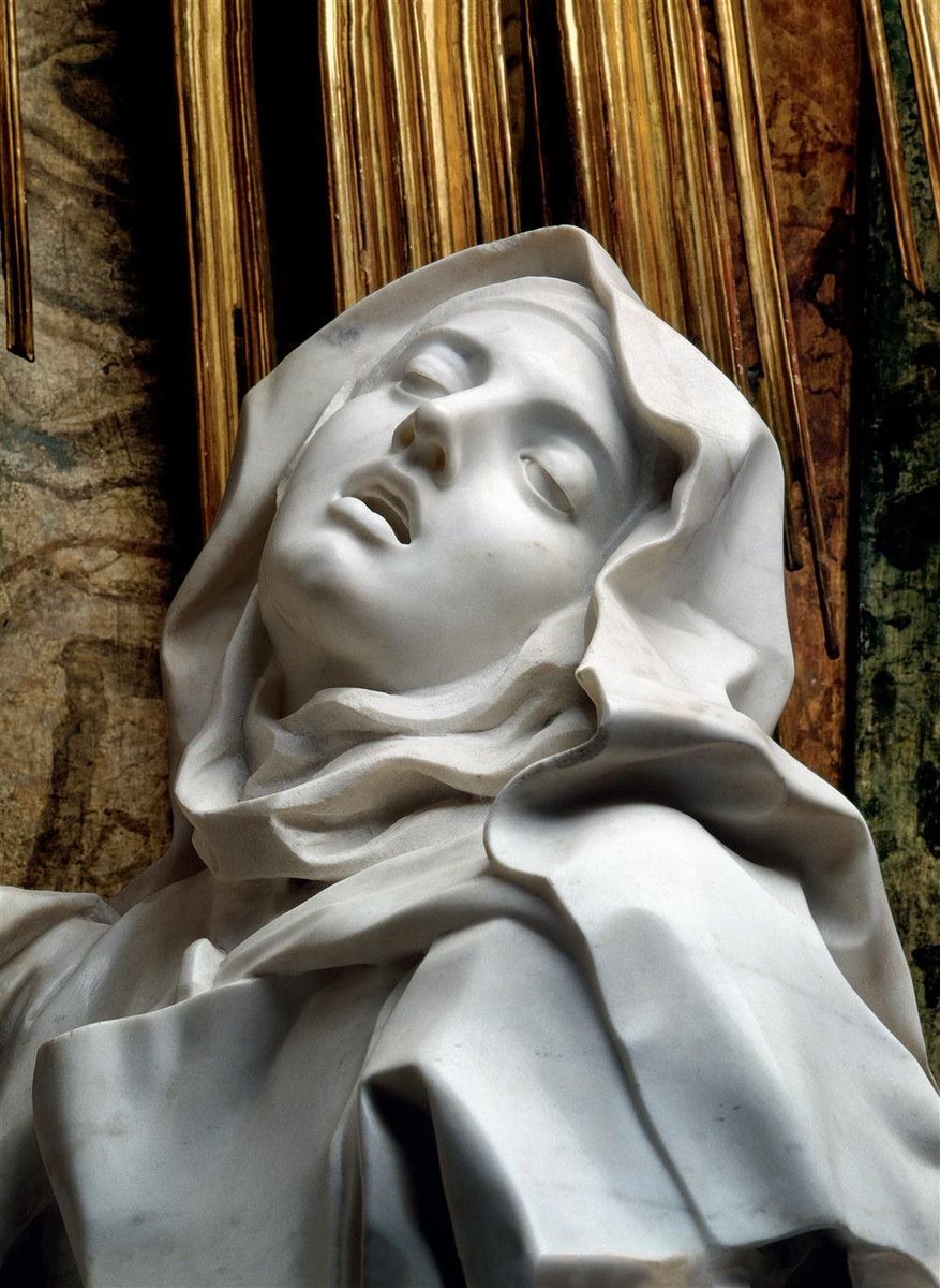
The Ecstasy of Saint Teresa (1652) Bernini
|
Researching older artwork, I decided to base one of my main inspirations off a statue named The Ecstasy of Saint Teresa by Bernini. The facial expression the sculptor gives off is slightly uneasy, which I thought that this would balanced around my theme relating to phobia's, as the phobia I choose for this project was "Claustrophobia". I loved the angle in which the statue is looking down at, and how slanted the eyes look. The smooth exterior of the face and clothing shows of the Baroque art style of the piece. I know from looking at how realistic the sculpture looked that pulling off a realistic perspective would be too challenging, do I settled for a semi-realistic output. The grey and white lighting makes forces me to paint in a greyscale fashion in order to simulate specific shadows and highlights the statue has itself.
|
Sketches:
|
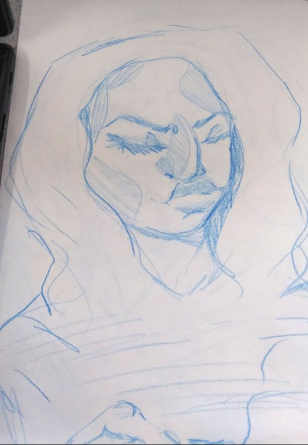
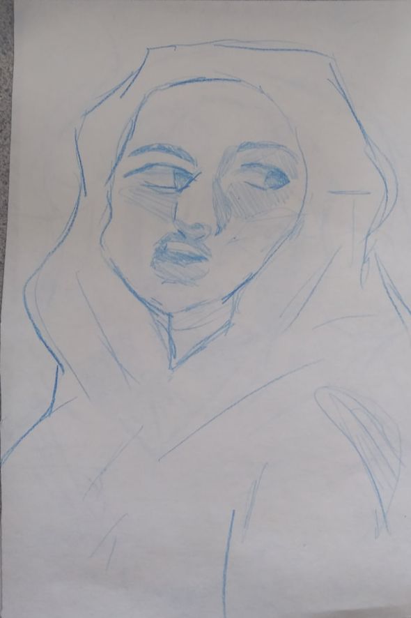
Sketch 1:
This was my first idea for the project I had. I knew I wanted to have some woman cloaked and shielded away from society, but I was unsure of what pose I should present. This was a process of me experimenting with different facial expressions and body poses. |
|
Sketch 2:
I thought into looking into the Baroque art movement, and I saw the statue the Ecstasy of Saint Teresa, and I thought of it being a good reference to use. I love how the head is tilted more upward, but in this sketch I was creating a rough outline of the face for a future insight. |
|
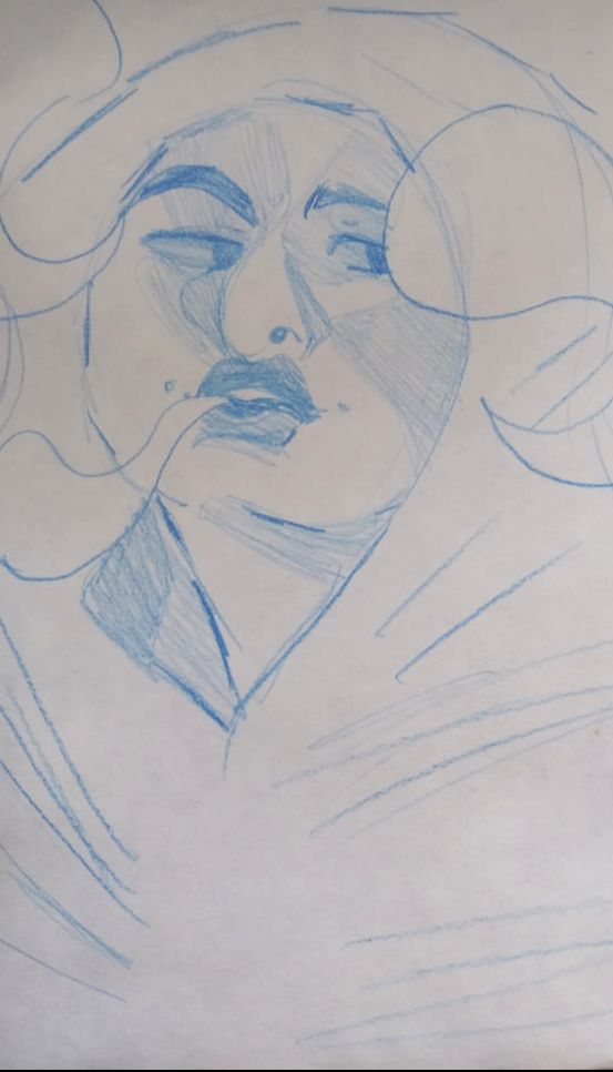
Sketch 3:
I wanted the thought from the second sketch to look more complex, so I decided to think of more objects I could add. I realized how much of a challenge it would be to incorporate an Impressionist inspired look to a digital painting, but regardless, I look towards the Starry Night. The large circular blobs around the figure are the outlines of clouds. |
Process:
|
*Click to enlarge slideshow process*
|
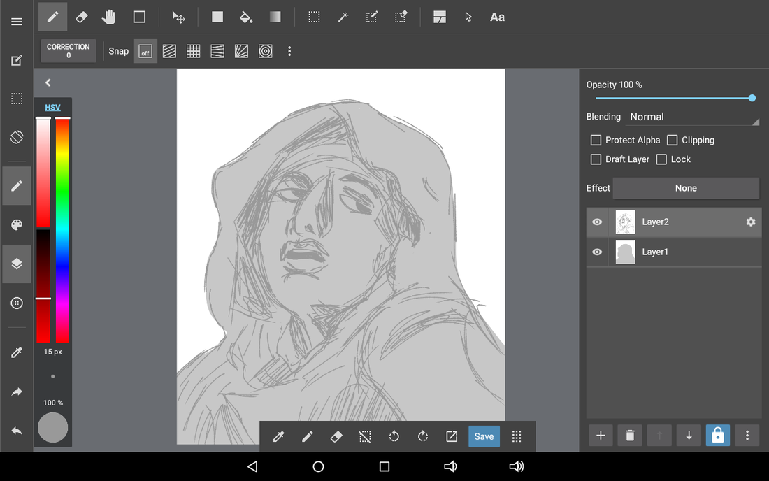
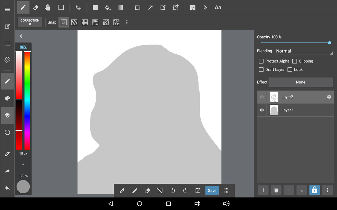
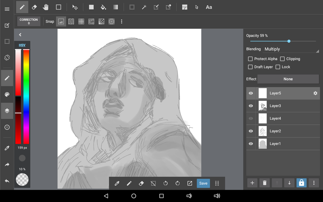
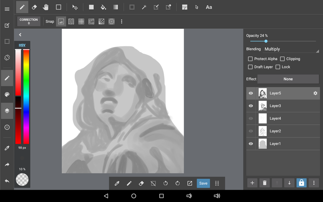
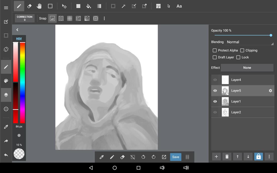
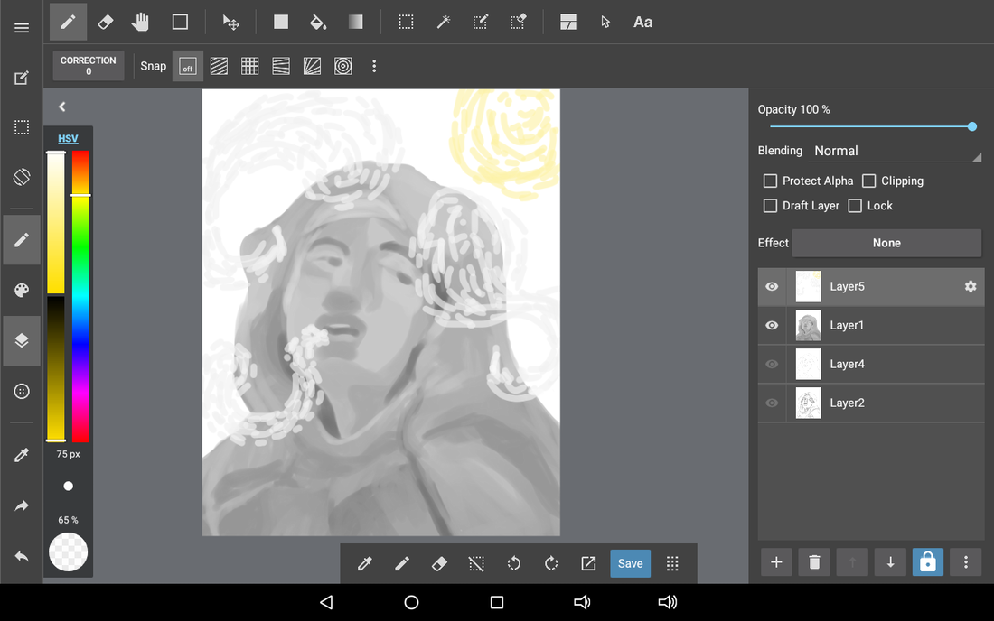
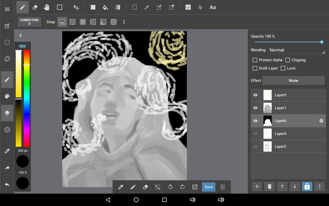
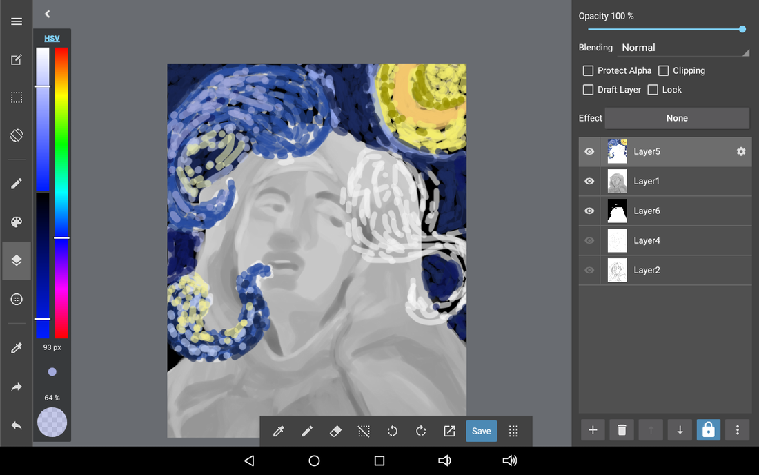
Process (for the digital drawing aspect):
First, I drew out my sketch digitally on the program, using the pencil tool. I set the pencil tool to 100% opacity, so I can make sure of what lines I'm sketching out. After I was fairly confident in what I sketched out, I went on a separate layer, and filled in the entire sketch in grey, since I wanted to work from a greyscale. I set the pencil sketch layer on top, so I can be sure of what I want to be shadows and highlights. I started making mental notes with each part of the face and cloth of the woman of what I wanted to be shaded in. When I was finished planning out, I added a layer on top of the grey layer, but below the pencil sketch and starting filling the shadows with a slighter darker shade of grey. At first, I used the airbrush tool, and slowly build off using the pen tool as I was confident in which shadow should be darker. Overtime, I would add more layers and make the shadows darker and darker. I deleted the pencil layer since I didn't need to reference where the shadows were anymore because I was confident what parts are shadows and what parts are highlights. To make sure the shadows were blended evenly, I used the watercolor brush tool to force the grey hues together and blend them into separate grey shadows. This helped smooth out the edges slightly, and blend in the clothing of the piece. For the highlights, I went back to using the pen tool on 5.0 point, and added highlights to sections where light reflected off of them using premium white. I used the blur tool next to the eraser to blur out the edges of the highlights, so it would seem more transparent. After I was happy with each of the grey toned layers, I merged all of the layers together into one. My last section of the piece was recreating the Starry Night, so I set the smooth pen tool to 19.2 point, but I lowered the opacity to 52% so the colors could visibly seen overlapping each other. I started with white to lay out the outline first, then I started filling it in with oranges, blues, purples, and yellows. I used the bucket tool to fill in the background completely black, so I could see where I needed to paint. After I finished layering each cloud, I saved all of the files to my flashdrive. |

|
*Click to enlarge slideshow process*
|
Process (for setting up the board for the illustration):
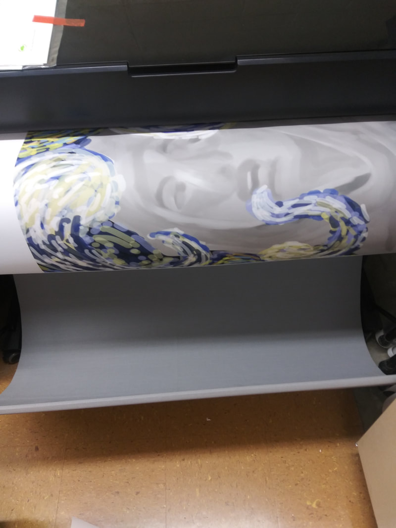
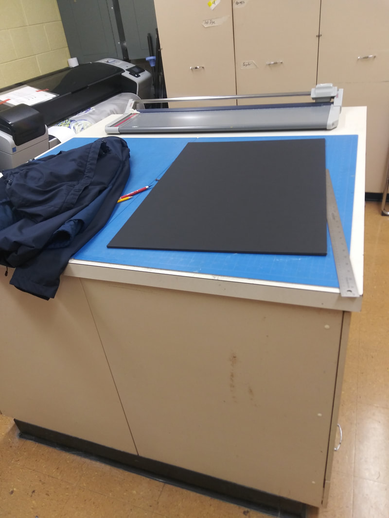
After the illustration was finished, I started setting up my board for the illustration. I grabbed a 20' x 30' inch foam cord board, and placed it off to the side. The first thing I needed to do was print out my illustration paper from the printer, so I turned on the large printer used for poster sized sheets of paper. I waited for the printer to load all of its systems, then I plugged in my USB flashdrive in the USB port available on the side of the power button. I pushed the USB option on the screen and I waited for the illustration to print out. In the meantime, I was setting up a different area so I can prepare to spray down the illustration to the foam cord. After the illustration printed out, I measured each of the sides on my foam cord board. The height and the width were too long for the board, so I had to trim down the sides slowly so it could fit evenly on my board without creasing. For this, I used the sharp paper cutter to cut a straight line instead of using scissors because my hand gets shaky and could create multiple curves in the paper. When the illustration was evenly cut, I decided to start my gluing stage. I set up a nearby table with several newsprint papers so the glue wouldn't dry to the table. I turned the illustration over, then I sprayed the entire backside and I sprayed the corners extra so they would stay better. I asked a friend of mine to hold one side of the illustration, then I slowly patted down the paper so it would stick to the foam cord. Afterwards, I trimmed off the excess and wrote my name on the back of the board in silver sharpie. |


|
Experimentation:
For this project, I used a different digital art program than I was use to. The normal program I use is Ibispaint x, but that program didn't have a high enough resolution or size for this project, so I had to resort to this program. I had some difficulties with setting up the digital canvas, and measuring out the size. I was unsure of the measurements since it was in a different measuring unit. I also struggled with using the different brush and eraser tools. I didn't know where to access the materials, since I didn't understand the outline of the digital program. I wouldn't suggest this program for myself for the future, because I found it to be too complex. |
*Click to enlarge slideshow experimentation*
|


Starry Night (1889) Van Gogh
The Ecstasy of Saint Teresa (1652) Bernini
|
Compare & Contrast
Compare:
|
Final Piece
|
Reflection:
Critique:
Overall, I enjoyed this project the most so far from the others, considering I have huge experience in the digital art medium. I would draw digital art on my free time and practice different brush strokes and layer settings. I had fun coloring in the the outline of the piece, especially since it gave me more experience with using the greyscale method when shading. Painting in an Impressionist art style is difficult, considering I didn't have a stylus to complete my choice project. I used my index finger to shade in large areas or blend. For the Impressionist aspect, I had to repeatedly tap my finger on the tablet screen, in order to give off an Impressionism look. Blending the statue in a Baroque style to make it look semi-realistic, was challenging as well, but after each layer was finished, it was easier to fill in.
When setting up the board for the illustration, I had a significant amount of trouble getting the illustration to fit the foam cord proportionately. I had to constantly cut and reshape the corners so they fit. For the gluing stage of the illustration, I had to keep re-doing each side since it wouldn't stay on straight. The accidentally made me bend and tear the bottom end of the board. I tried my best to smooth it out, but it still came out rigid. In the future, I'll make sure not to rush my gluing process to prevent any tearing.
ACT Responses:
Clearly explain how you are able to identify the cause effect relationship between your inspiration and its effect on your artwork?
My work represents the Impressionism movement as displayed in the background (Starry Night), and the woman in the illustration is the closeup on the face of the woman in the Ecstasy of Saint Teresa.
What is the overall approach the author has regarding the topic of your inspiration?
There wasn't an overall approach either artist had when creating their artwork, based on studying them, I can make the assumption that one artist used the sky as a reference for his piece, and the other used a model.
What kind of generalizations and conclusions have you discovered about people, ideas, culture, etc, while you researched your inspiration?
I can conclude that within majority of the Impressionist paintings are sceneries, while Baroque would use female models, either nude ore clothed, in more feminine positions.
What is the central idea or theme around your inspirational research?
My theme around this piece was fear, but I wanted to go more in depth and use specific phobia's people endure on a day to day basis. I decided to use the basic common phobia up to 5 percent of people, claustrophobia.
What kind of inferences did you make while reading your research?
I inferred that Impressionism artwork is more abstract and captures the general idea of how a scenery or human generally look,without using standard colors that are expected (for example, a human face in Impressionism work can be made up of yellows, reds, and blues instead of a typical peach color). The technique when trying to paint in a Impressionist fashion is messy, considering the artist adds several layers of paint without washing their brush. For Baroque, I was trying to achieve a smooth, clean skin type to resemble realism.
Bibliography:
“Starry Night’ by Van Gogh Print.” The Original Underground, theoriginalunderground.com/products/starry-night-digital-art-print
“Ecstasy of Saint Teresa [Gian Lorenzo Bernini].” Sartle, 27 Dec. 2018, www.sartle.com/artwork/ecstasy-of-saint-teresa-gian-lorenzo-bernini.
“(1)Using Tools.” MediBang Paint, medibangpaint.com/en/use/2015/03/manual2-1/.
“The Official Site for MediBang Paint, the Free Digital Painting and Manga Creation Software. You Can Download the Latest Version of MediBang Paint Here, and Get News and Tutorials.” MediBang Paint, medibangpaint.com/en/.
