Diptych Illustration (Gouache):

|

|
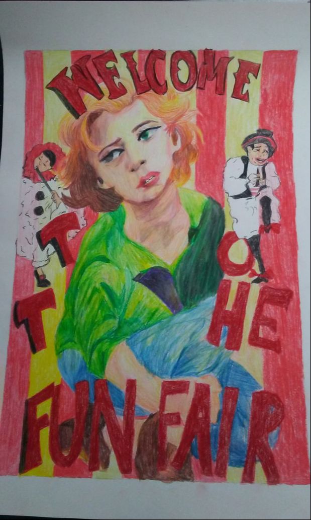
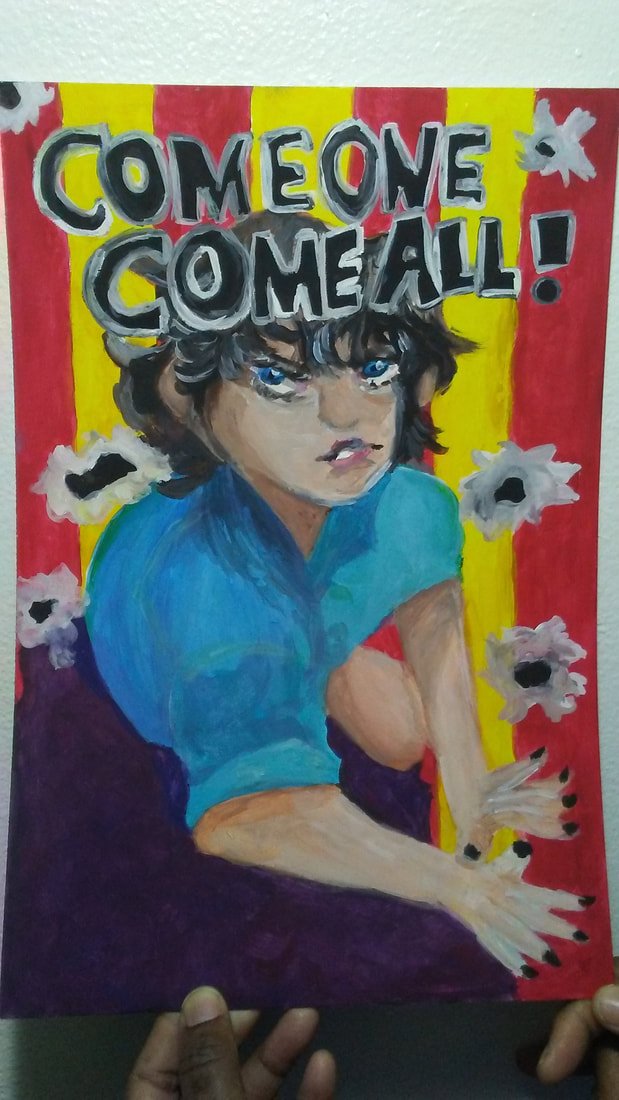
"Cinematic Attraction"Gouache painting on Illustration Board
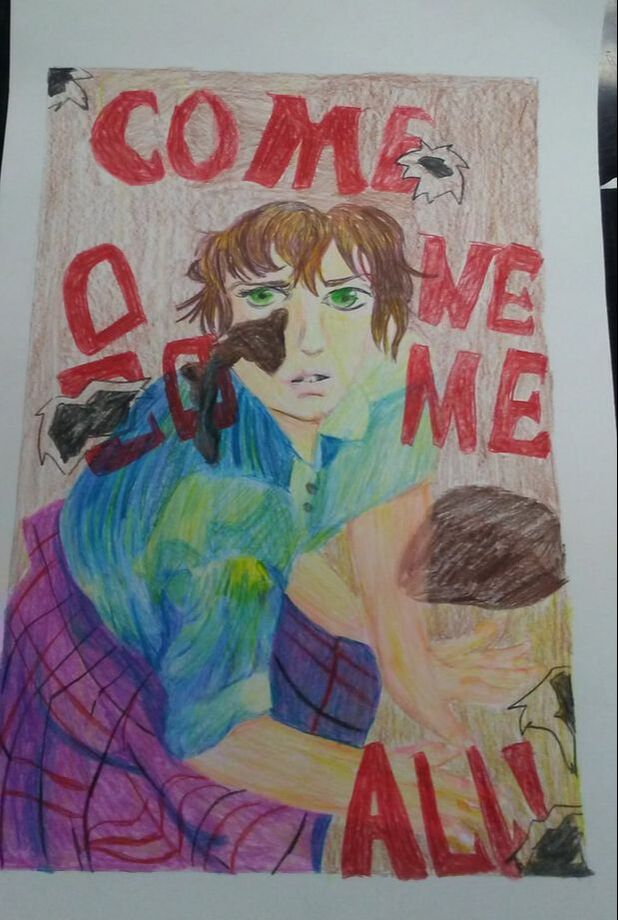
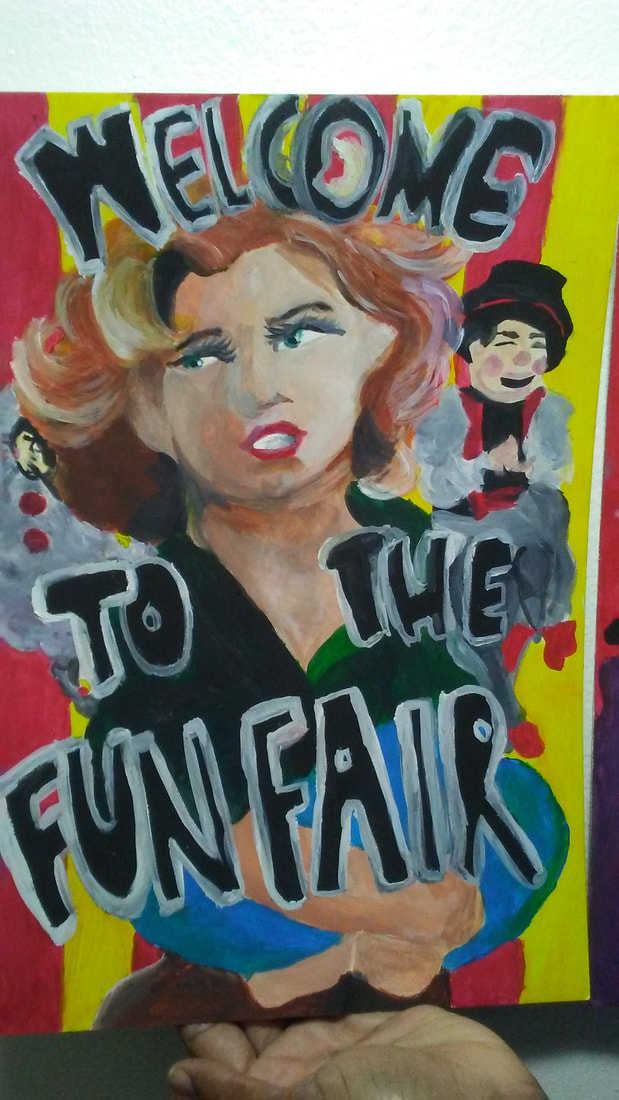
12cm x 16cm January 15, 2020 Exhibition Text: The piece "Cinematic Attraction" is inspired by the Post Modern art movement, specifically by the photographer/artist Cindy Sherman. The poses within her photographs are the main contraption of each panel. In one panel, I wanted to incorporate the feeling of being idolized using carnival posters. In the second panel, I wanted the poster to look more worn out and torn to represent the feeling of being forgotten. Both together show a contrast between admiration and neglect. |
Planning:
|
|
Inspiration:
I wanted to look more towards Post Modern Art because of their cinematic angles. I adored how Cindy Sherman was able to capture dynamic poses in her photographs. For the first pictured labeled Untitled Marilyn, she is looking off to the far distance in unbuttoned clothing. I thought that this picture would make a great reference I wanted to establish my Diptych around admiration and neglect. By researching, Marilyn Monroe was Idolized by other men, and was considered the star attraction at some points. She was even considered a hero to true beauty and success. On the other hand, the second picture (which is one of the most single handedly famous photographs) is Untitled #92. This photograph is famous for the young girl's expression in the picture. The look of fear on her face inspired me heavily to some way shape or form contribute this photo into my Diptych Illustration. She fitted in perfectly with my neglect side of the panel, so I wanted to make this panel to look more murky. Not only did I base panels off of these two illustrations, I thought of basing it around vintage carnival posters. I used the striped background on the poster to the left, and for the right, I used the cartoon men. |
|
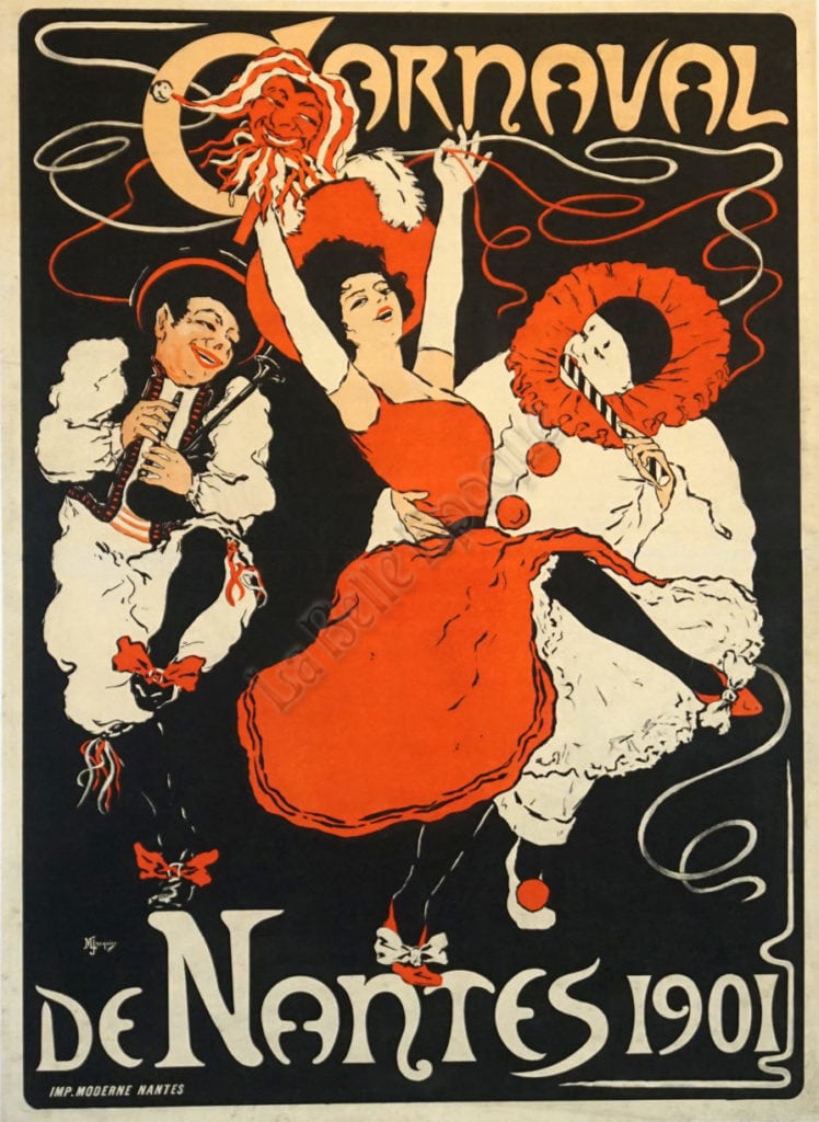
I wanted to base my idea more off of a vintage carnival template. I wanted the background to be more circus like, so I decided to draw in some vintage yellow and red striped background. I ended up just making this a key factor in the first panel rather than the second panel.
I decided I wanted to illustrate the male figures to the right instead of the female figures because I found their clothing design/facial poses more interesting to capture. |
|

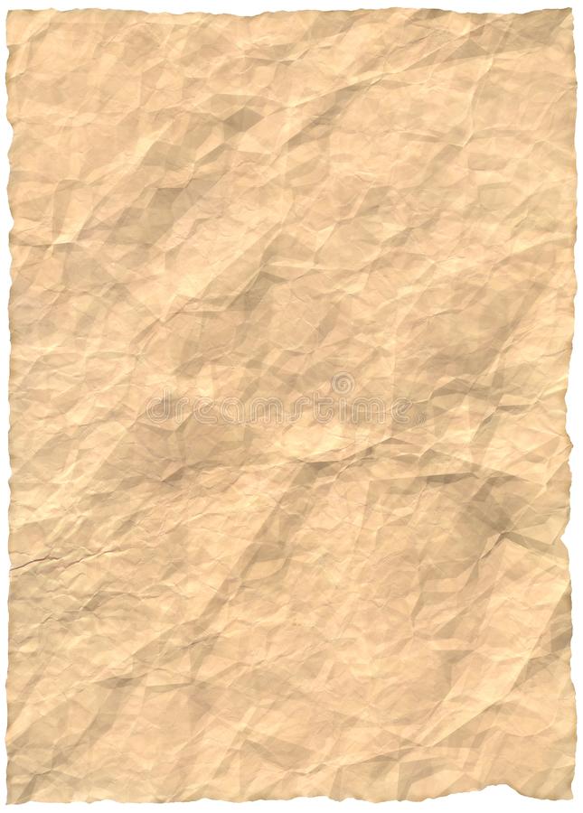
https://www.dreamstime.com/free-photos-images/old-paper.html
|
To the left and right side are old oil spilled wrinkly papers. I've never attempted to actually create a wrinkling or holey affect with a piece of paper, so I knew this section would give me a challenge. I figured since I wanted to give off a older vintage look to the second panel. I made the background more yellow/brownish color (this illustrates a stained paper).
|
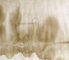
https://fourthconeblog.com/2016/10/03/movie-poster-restoration/
|
Sketches:
|
Sketch 1:
For the first sketch, I decided to use pencil so I can shade certain areas. I was envisioning the dots in Roy Lichenstein's artwork in Pop Art movement. I also wanted to incorporate the flowers and intricate lines (I used pencil so I could erase and create a cleaner line). Although I knew the piece had to completely be in colored pencil, I wanted to plan it out first. I tried to use more of a crosshatched shading technique when I'm inscribing. In the end, I ultimately disliked this sketch completely. |
|
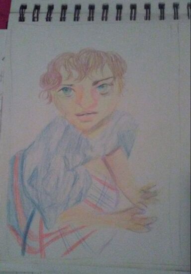
Sketch 2:
The second sketch is what I ended up referencing in my final piece. I wanted to look more into the Post Modern art movement, and analyze how dynamic and lively their poses are. I felt confident creating this sketch, so I decided to fill it in with colored pencil faintly. I wanted to practice slightly before actually starting my final piece. |
|
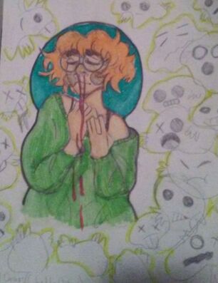
Sketch 3:
This sketch is more of a magical representation of my piece. I wanted to draw the it within ghosts and and different colored scales. This sketch was more off the top of my head when I didn't have any inspiration. This was more of a trial-and-error. I thought the overall concept of the drawing was unique, but it didn't fit and of the standards I was looking for. |
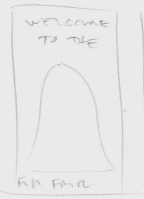
I applied some suggestions from an interview with an IB examiner (named Katie). She was suggesting my word placements for the gouache piece.
Process:
|
|
Process:
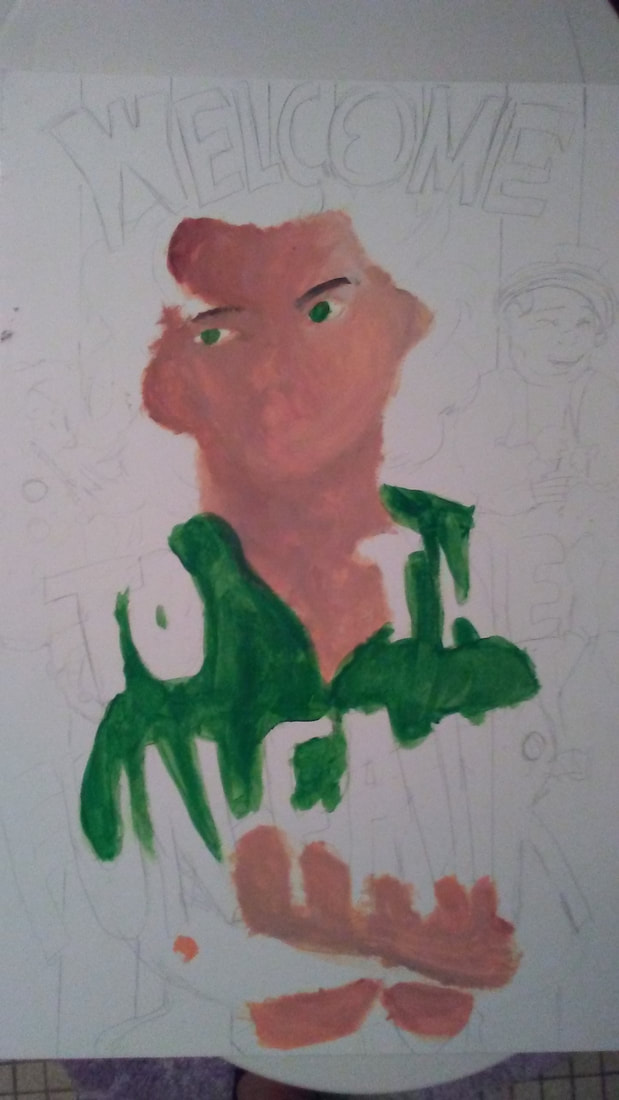
After the colored pencil illustrations were finished, I was ready to start my illustration boards. Using a large cutter, I was able to slice the board evenly in half, creating a 12cm x 16cm board. I measured both of them to make sure that the measurements were exact, then I refined the edges that weren't cut properly. As soon as the board was finished and ready to be painted, I first made some swatches in my sketchbook. I was testing out the colors provided me, seeing how the hues would match up. Next, by each panel, I started to slowly sketch out my figures starting foreground to background. I wanted to make the sketch as accurate to the colored pencil illustrations as possible. When the sketching aspect was complete, I finally started painting my illustrations boards with gouache. I decided to paint the skin tones first for both boards so I can have a consistent skin tone, and wouldn't have to worry about the paint drying over time. For the skin tone, I mixed carmine red, sienna brown, titanium white, and sunflower yellow. The skin tone came out darker than I anticipated, but regardless I couldn't make it lighter, no matter how much white or yellow I added. Creating shadows within the skin were easy since clue could substitute for black as a dominate hue. Creating highlights however, I had to make a separate section for a lighter shade, the use the normal skin tone. The clothes and accessories were easier to paint, since I didn't necessarily have any limits when it comes to shadows and highlights. The shirt in the second panel for example is a prime example. The blue hues were pigmented well and easy to manipulate for highlights since I could add more water to the painting, and fig around and move away some of the pigment. For shadows in both panels, mainly for the hair, I had to add midnight black with sienna brown, since the tube that contained the burnt umber brown had some type of malfunction. The paint inside the tube was chunky and refused to spread at all. For the backgrounds, I used red and yellow straight from the tube, and started layering. I wanted the color to look rich and defined. The "tears" for panel two was simply from greyish tone, mixed with a black hue. I was try to give off an old effect, but since I couldn't go over the background in water (since the gouache would spread around quickly) I decided to add rips. |
*Click to enlarge slideshow process*
|
Experimentation:
Before I started painting my illustration board, I wanted to test out the medium and make swatches out of it. Since I never used it before, I wanted to see how it spreads or blends. I was having trouble using it, so i hoped for the best and used more white paint for blending certain areas. While painting with gouache, I looked up some short tutorials on how to blend and layer with the medium. Before researching, I had trouble with spreading around the paint, since I layered too much in one area, that I couldn't make the shade lighter no matter how much Titanium white I add. All the tutorials had one similarity in common, that I should start off in a watercolor fashion, then build up on the opacity as I move along. The video also stated that the medium should also be treated as acrylic paint once you are confident in where the shadows and highlights be placed. I should have used more water and made small hints to myself where I should have added the highlights and shadows before I started my final piece. |
*Click to enlarge slideshow experimentation*
|
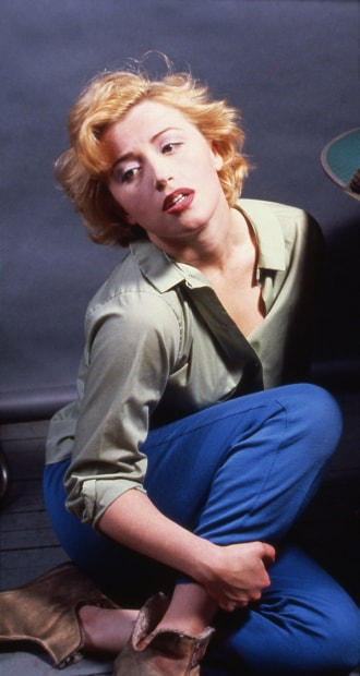
Untitled (Marilyn), Cindy Sherman 1982
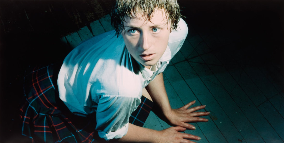
Untitled #92, Cindy Sherman 1981
|
Compare and Contrast:
Similarities:
Differences:
|
|
Reflection:
Critique:
Overall, I believe my Diptych Illustration could have turned out better. I didn't like how I applied layers of gouache, especially in the first illustration board. I felt that I shouldn't have quickly started painting my piece, instead I should have researched a bit more on the medium and experimented with the blending/layering. Some areas of the portrait became evident that I rushed. In future reference, I should wait for the paint to dry instead of just trying to create shadows out of a wet surface. In result of this, I used too much white paint for the first board, making it difficult for me to blend colors after I used majority of it. I feel I should have spent more time on swatching as well because I was having problems coming up with color choices and lighter shades. On a slightly brighter, I am happy with how the shadows and highlights in the clothing turned out, considering this is mu first time using gouache. The skin in both pieces are my I m disappointed with slightly, but I know I can improve from this for the future!
Overall, I believe my Diptych Illustration could have turned out better. I didn't like how I applied layers of gouache, especially in the first illustration board. I felt that I shouldn't have quickly started painting my piece, instead I should have researched a bit more on the medium and experimented with the blending/layering. Some areas of the portrait became evident that I rushed. In future reference, I should wait for the paint to dry instead of just trying to create shadows out of a wet surface. In result of this, I used too much white paint for the first board, making it difficult for me to blend colors after I used majority of it. I feel I should have spent more time on swatching as well because I was having problems coming up with color choices and lighter shades. On a slightly brighter, I am happy with how the shadows and highlights in the clothing turned out, considering this is mu first time using gouache. The skin in both pieces are my I m disappointed with slightly, but I know I can improve from this for the future!
ACT Responses:
Clearly explain how you are able to identify the cause effect relationship between your inspiration and its effect on your artwork?
I wanted to propose dynamic poses of the photographs, and contrast it with vintage carnival posters. This demonstrates relevancy and idolization.
What is the overall approach the author has regarding the topic of your inspiration?
The photographer Cindy Sherman didn't necessarily have an approach with her artwork, it was more "in the moment." She was able to capture expressions within the moment it occurred, giving the photograph a extra depth of meaning.
What kind of generalizations and conclusions have you discovered about people, ideas, culture, etc, while you researched your inspiration?
The photos seemed more "real time" rather than looking scripted. The expressions look more natural rather than being rehearsed.
What is the central idea or theme around your inspirational research?
This project didn't quite wrap around my theme of fear.
What kind of inferences did you make while reading your research?
I can infer that the Post Modern art movement contained flashy and more expressive poses than any other art movement.
Bibliography:
Metmuseum.org, www.metmuseum.org/toah/works-of-art/1981.159/.
“Vector Illustration of Vintage Circus Posters on Striped Background..” 123RF, www.123rf.com/photo_57959266_stock-vector-vector-illustration-of-vintage-circus-posters-on-striped-background-with-space-for-text-decorated-wi.html.
“French Art Nouveau Vintage Carnival Poster 'Carnaval: Nantes 1901' by Jacquer: Vintage Posters by La Belle Epoque: Vintage Posters in NYC.” Vintage Posters by La Belle Epoque | Vintage Posters in NYC, vintageposters.us/product/french-art-nouveau-vintage-carnival-poster-carnaval-nantes-1901-by-jacquer.
“Free Old Paper Pictures, Stock Photos and Public Domain Images.” Dreamstime, www.dreamstime.com/free-photos-images/old-paper.html.
Fourthconeblog. “Movie Poster Restoration.” Fourth Cone Restoration Blog, 4 Oct. 2016, fourthconeblog.com/2016/10/03/movie-poster-restoration/.
