Project 5:
|
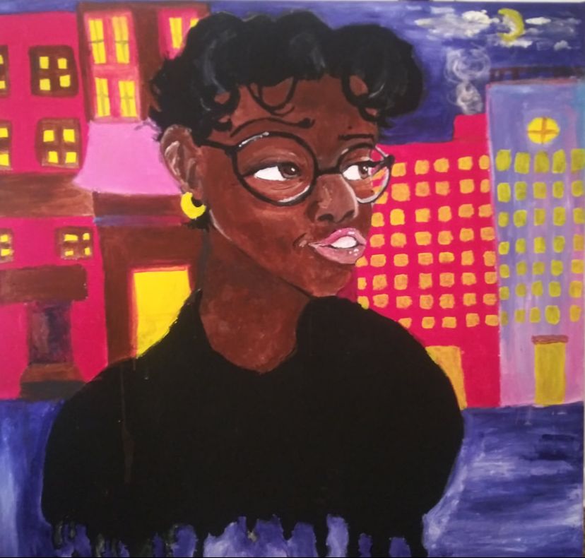
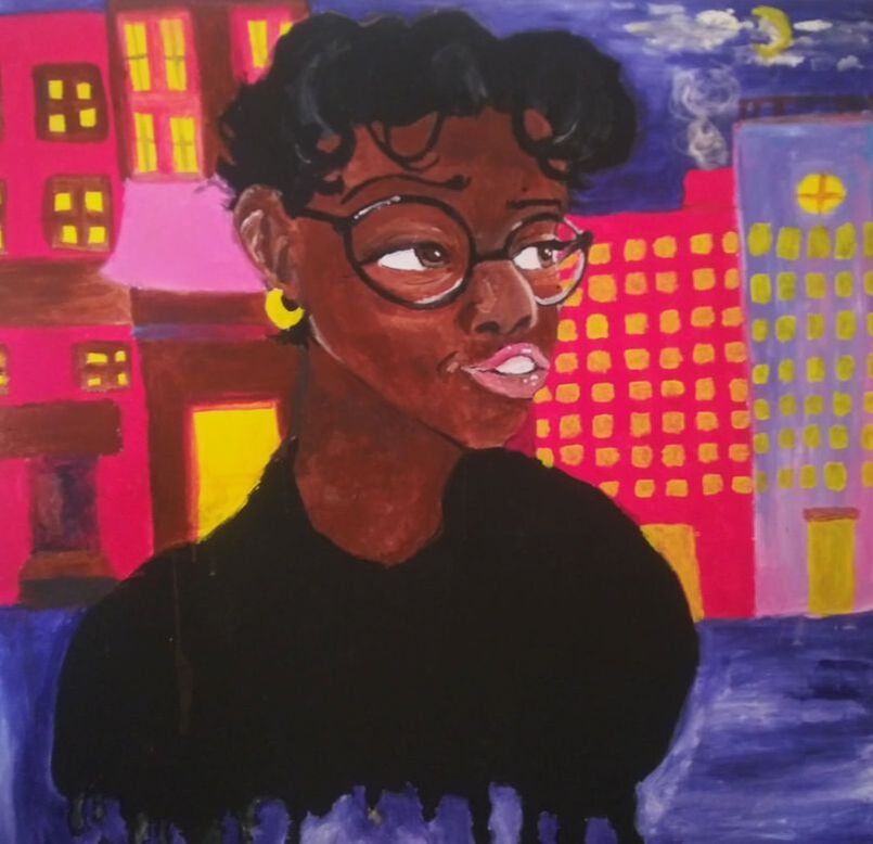
"Baby Face"Acrylic Paint on Canvas
91cm x 91cm April 15, 2020 Exhibition Text: Baby Face represents my fear of growing up and being an adult outside from my parents (wondering how it would be like living by myself). This painting style is mainly inspired by the art movement Baroque, specifically by the artist Caravaggio and the painting I chose "Boy with a Basket of Fruit", Caravaggio The title of the piece is personal to me since family members claimed that I had such a baby face, and I look young and innocent. |
Planning:
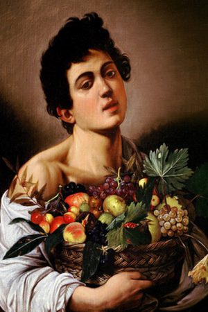
Boy with a Basket of Fruit, Caravaggio 1595
|
Inspiration:
I decided to base my painting in a Baroque style, as I wanted to give off a smooth and well blended texture. Caravaggio inspired me to try and attempt a polished painting style, considering his other artworks are well blended too. I thought that this would incorporate some type of challenge with my art style, as it is difficult for me to create anything smooth-like (I prefer to do things more sketchy or solid colors). This painting also caught my attention on how effortless the skin looked like painted, and how realistic the color palette looked. The skin and fruit in the photo look soft and gentle. In my piece, my goal is to make my overall skin look as smooth and blended as possibly. |

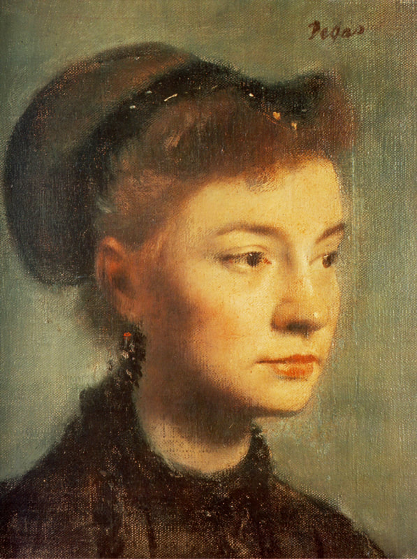
Portrait de Jeune femme Huile sur Toile, Degas 1867
|
"Portrait de Jeune femme Huile sur Tolie" (translation: "Portrait of Young Woman Oil on Tolie) interested me because of the angle in which the head was painted in. Typically when drawing or painting, I tend to prefer looking for inspiration from pieces having a head tilted in a 3/4 perspective. I wanted to base majority of my sketches off of this one painting since I thought the angle was perfect. Her hairstyle is slightly similar to my hair style (don't have a bun in the back, but the front is curled), so I thought it would be great to use this painting as my main inspiration for my self portrait piece. I adore the woman's expression in the piece and how soft and detailed she looks in the Impressionist art style. The shading didn't involve the color black, rather darker browns or blues lightly mixed with the skin tone. For my piece, I want to stay away as far as possible from using any black as a shading tool in my artwork.
|
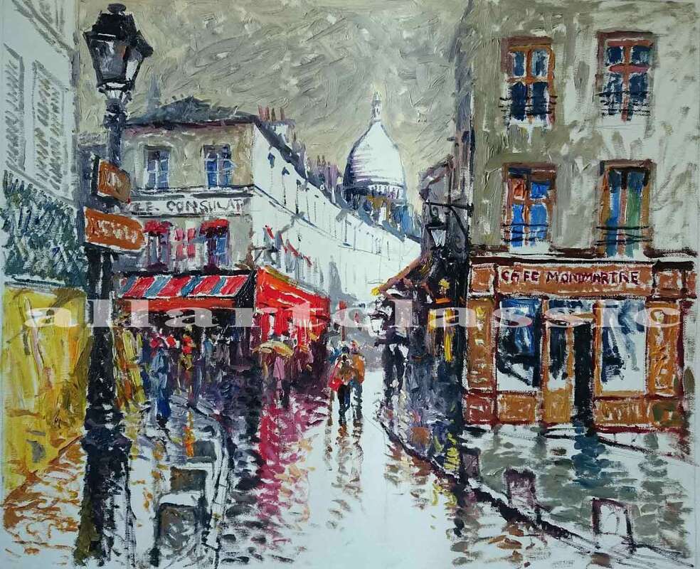
https://www.allartclassic.com/w_painting.php?number=impressionist-style-canvas-painting
|
This background landscape I thought would be a good inspiration to my self portrait piece. I don't plan on using the same painting style as the painting presented to the left, but I do like the shape/detail of the buildings in the picture. It makes a great reference without having to look outside.
|
Sketches:
|
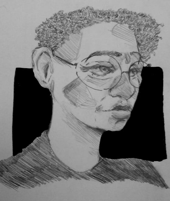
Sketch 1:
This is a sketch of my face that I wish to incorporate in my self portrait painting. I took a picture of myself and used it as a reference (photo located to the right). I thought this sketch suited my standards. I decided to change the hairstyle since it doesn't match my current look, and I want the piece to be as accurate as possible. |
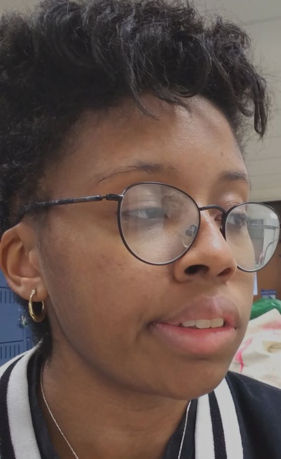
(I'm not very good at posing for pictures.....)
|

|
Sketch 2:
This sketch is a basic city landscape that I plan on using in the piece. I'm not that experienced when it comes to painting backgrounds, especially buildings, so I was unsure on how the perspective should look. I thought it would be best to just sketch the buildings out in pen, and go over it in watercolor. |
|
Sketch 3:
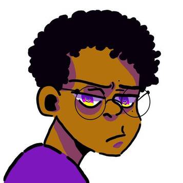
This was an digitized sketch on how I wanted the piece to originally be colored. I feel more comfortable drawing and coloring in my sketches digitally rather than with pencil. Unfortunately, I realized wouldn't be able to pull off half of those bright colors within the piece so scrapped this idea. I did however decided to keep my overall body language. |
Process:
|
|
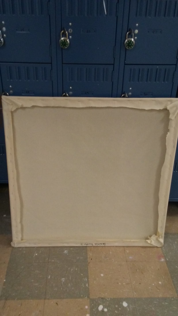
Process:
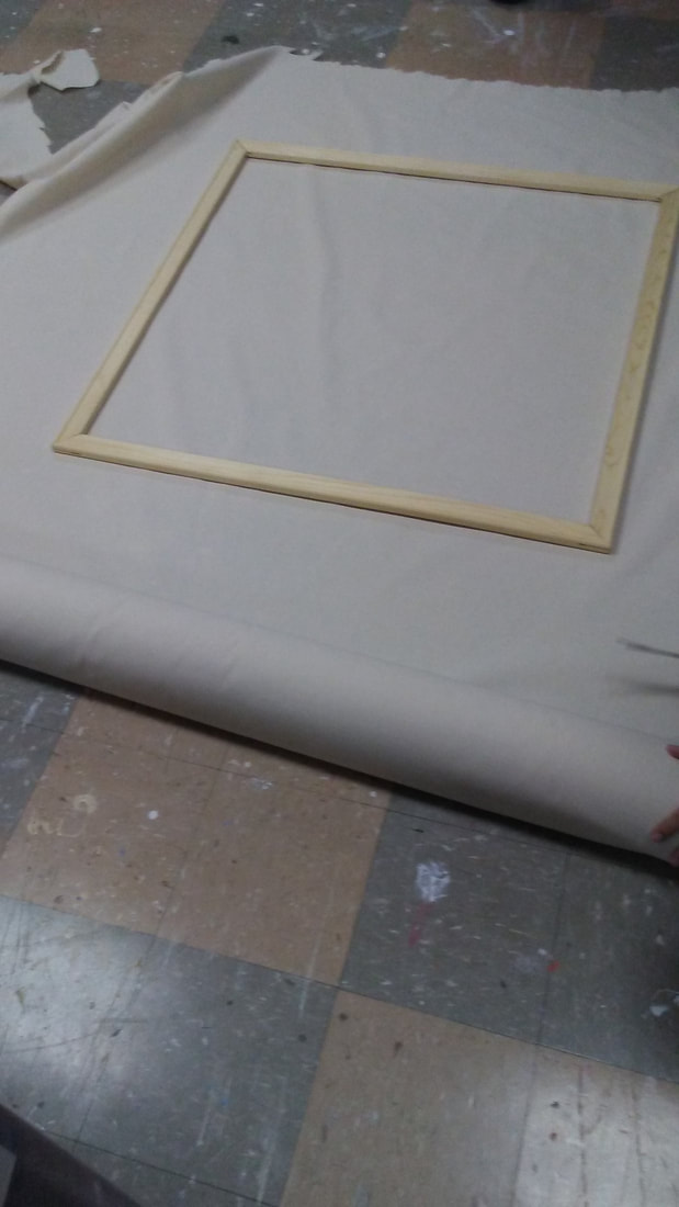
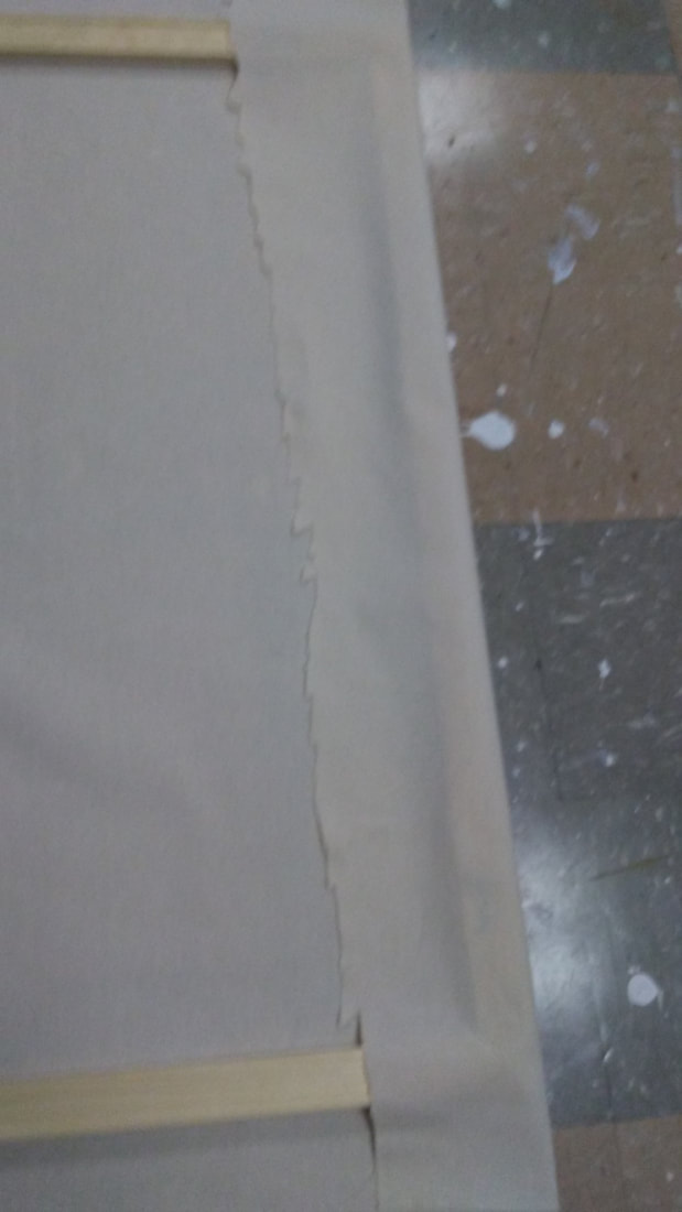
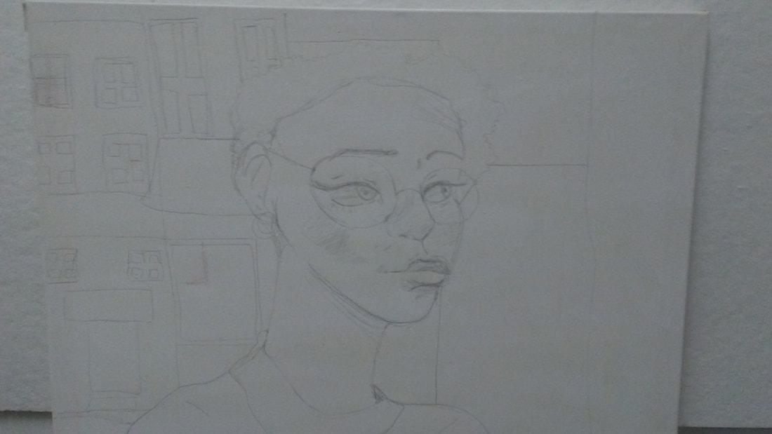
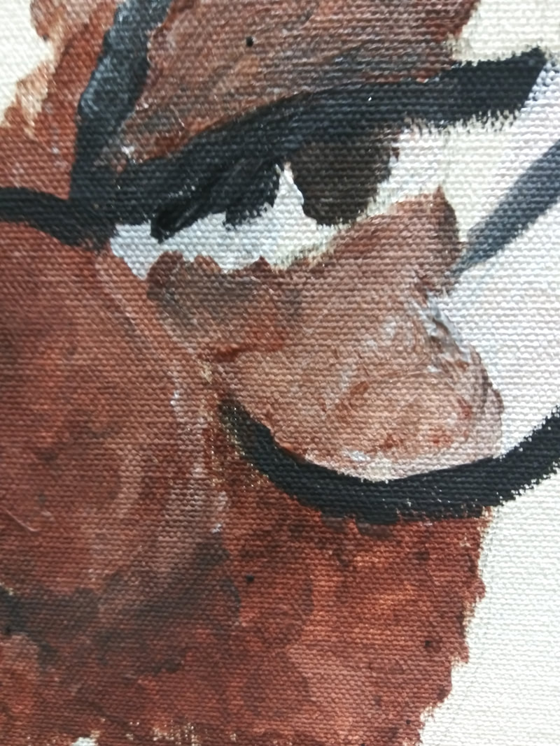
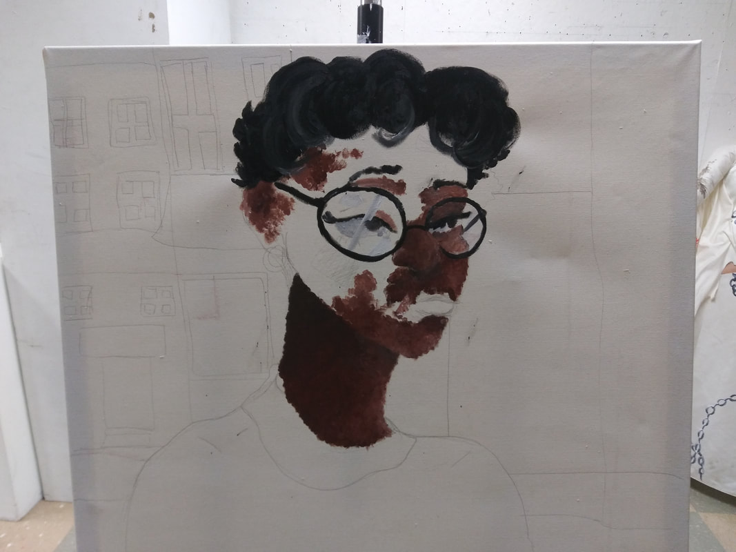
To create my 3ft x 3ft canvas, I first had to put together the 3ft stretchers (making sure the stay in place) and set them down on a nearby table. Next I rolled out a large canvas fabric and tried to measure how much I should cut to make the canvas, keeping in mind that I have to leave excess for the back. I slowly folded the small excess of canvas to the back of the stretchers, then from top to bottom on the back of the canvas, I started to staple gun the sides. For each corner I folded and stapled twice. I trimmed all the excess to make the canvas look neater, then I started to gesso. Since the canvas was large, I had to apply 3 to 4 layers. I set the canvas on a drying rack, and waited for it to dry. After I created my 3ft x 3ft canvas, I started to lightly sketch out my image onto the larger canvas. I started drawing my face and added small details so I could remember the shadows and highlights (I also shaded in small bits gradually with a wooden pencil). For the background, I drew tall buildings with windows, doors, and signs but I decided not to add any shadows and highlights since I wanted the background to be slightly faded. I also tried outlining the sky to see whether I wanted a cloudy atmosphere, or a night sky with stars. When I was finished sketching I made swatches and planned what colors I was going to use. Since I was going for an impressionist style painting, I wanted to make sure to have a variety of colors to choose from. I made sure to have different shades of browns, to yellows, and lighter shades of grey varying to black so I wouldn't have trouble thinking of any highlights or shadows. After I recorded the colors, I started to slowly paint the skin portion of my self portrait. While I started painting, I noticed how challenging it was to smooth out and blend the paint on the canvas. The canvas would absorb a large amount of paint in one area, making it hard to add any layers or show in depth. Painting my hair was another challenge to since I barely had any black or white paint to blend out, so limited how much detail I could add to the piece (the painting looks dull and lifeless somewhat because of the lack of color development). After I finished painting my skin tone and hair, I started completed the extra parts of my face (my glasses, earrings, lips, etc) using as much paint as possibly. After completing face/body proportion, I realized I had less paint than I have anticipated. This meant I had to utilize as much paint as possibly, and try to scavenger and find other paints to use. This force me to use my old crayola paints I had as a child, which were opaque watercolors. I used those combined with my last bits of acrylic paint to finish the background. |
|
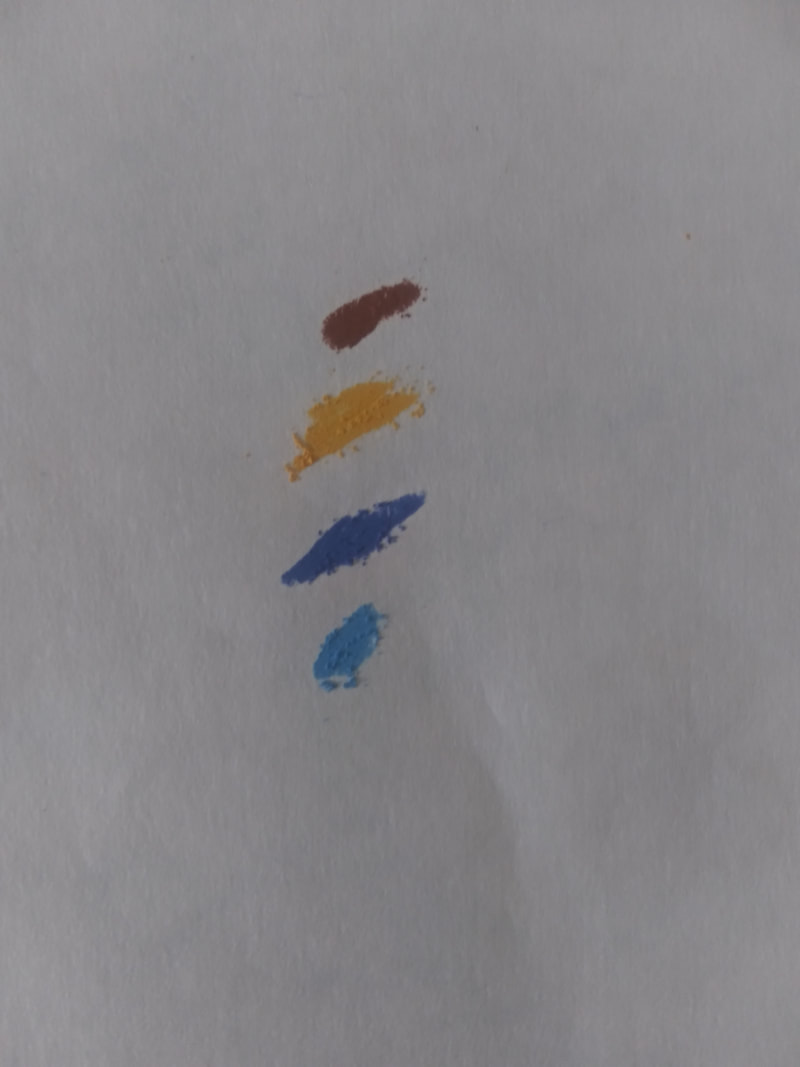
Experimentation:
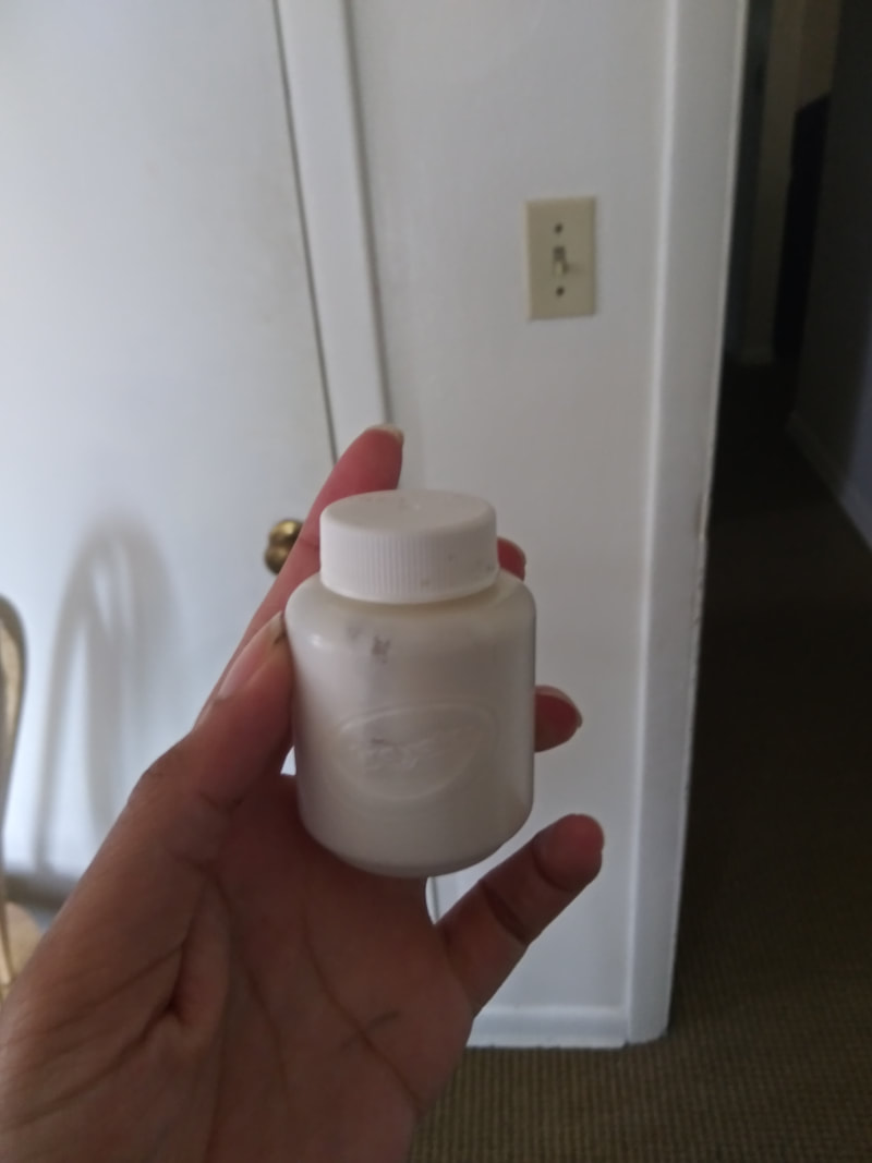
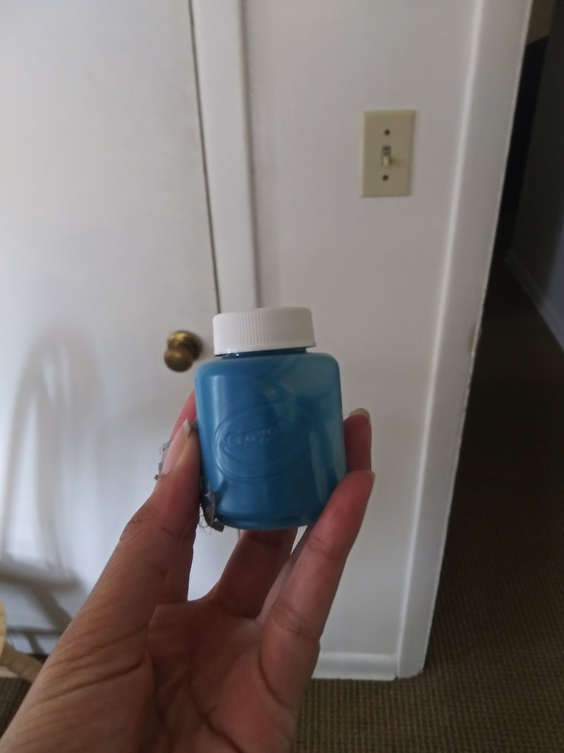
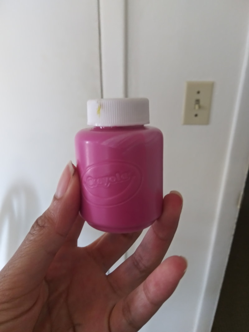
I wanted to experiment with different paints since sadly I was starting to slowly run out of the supply I was provided with. To the right shows a picture of some of the watercolor paints I decided to use. Since the watercolors were quite opaque, I thought they would be efficient enough to use to help finish off the background of the piece. I also tried to experiment with the colors I had to see different color combinations I could make (swatches) but I sadly didn't get around to using them in my painting since I had to spread around the small amount of paint I had. The canvas was large, and I tried to experiment with as much color placement as possible. |
|
Reflection:
Critique:
Overall this has been my least favorite projects out of the entire semester considering I had such high expectations for my painting style to improve from last year (considering I've practiced with multiple painting styles from several art movements). What I dislike most about the piece is the lack of colors I had access too. During the project, I sadly ran out of paint, and had no choice but to reuse the same colors in a different fashion. I feel because of that, the painting looks a bit muddy and lifeless. I wish I had a higher range in my color palette and prepared for this project better. I also plan to practice having a steadier hand because while I was painting, I was struggling to paint a straight line better yet make the brushstroke look even. Despite all of the negatives I have towards this piece, I did the dripping concept I was going for in the painting to make it seem like it was only a vision I was having for myself regarding the future. I feel like my face and hair were the overall best painted in the self portrait.
Overall this has been my least favorite projects out of the entire semester considering I had such high expectations for my painting style to improve from last year (considering I've practiced with multiple painting styles from several art movements). What I dislike most about the piece is the lack of colors I had access too. During the project, I sadly ran out of paint, and had no choice but to reuse the same colors in a different fashion. I feel because of that, the painting looks a bit muddy and lifeless. I wish I had a higher range in my color palette and prepared for this project better. I also plan to practice having a steadier hand because while I was painting, I was struggling to paint a straight line better yet make the brushstroke look even. Despite all of the negatives I have towards this piece, I did the dripping concept I was going for in the painting to make it seem like it was only a vision I was having for myself regarding the future. I feel like my face and hair were the overall best painted in the self portrait.
|
Boy with a Basket of Fruit, Caravaggio 1595
Portrait de Jeune femme Huile sur Toile, Degas 1867
https://www.allartclassic.com/w_painting.php?number=impressionist-style-canvas-painting
|
Compare & Contrast
Compare:
|
Final Piece
|
ACT Responses:
Clearly explain how you are able to identify the cause effect relationship between your inspiration and its effect on your artwork?
In the painting Baby Face, I was able to illustrate the fear some children have of growing up and being an adult, with the idea of my face being in front of some tall buildings in the background.
What is the overall approach the author has regarding the topic of your inspiration?
The neither artist didn't have a specific approach regarding their pieces, I can safely assume that both artist were going for a more elegant and youthful approach in their pieces due to how smooth they look.
What kind of generalizations and conclusions have you discovered about people, ideas, culture, etc, while you researched your inspiration?
I can generalized from the Impressionism art movement takes more time to complete, and that the artwork looks more soft and cloud-like (it looks more gentle and peaceful). From the Baroque art movement, and all the artwork looks smooth and gives off a realistic effect.
What is the central idea or theme around your inspirational research?
The theme that my piece was centered around was a child's fear of growing up or becoming an adult.
What kind of inferences did you make while reading your research?
I can infer while looking at the Impressionist and Baroque that they both similarly are hard to incorporate that art style into my painting style, Impressionism being soft and delicate, while Baroque being smooth and curvy.
Bibliography:
Caravaggio, Author: “Boy with a Basket of Fruit by Caravaggio.” Borghese Gallery, 2 Aug. 2019, borghese.gallery/collection/paintings/boy-with-a-basket-of-fruit.html.
“Cheap Fine Art. Hand Painted on Canvas Discount Paintings For Sale.” Cheap Paintings for Sale - Modern Impressionist Painting-Paris Street, www.allartclassic.com/w_painting.php?number=impressionist-style-canvas-painting.
“Portrait De Jeune Femme - Edgar Degas.” USEUM, useum.org/artwork/Portrait-de-jeune-femme-Edgar-Degas-1867.
